Year
2023
Creative Team
Dung Ngo, Nhi Bui
Supervisor
Sweii Chong
Support
Tinh Truong, Bam Tran
Scope of Work
Visual Identity, 3D Concept, Interactive, Animation
Accolades
![]()
![]()
2023
Creative Team
Dung Ngo, Nhi Bui
Supervisor
Sweii Chong
Support
Tinh Truong, Bam Tran
Scope of Work
Visual Identity, 3D Concept, Interactive, Animation
Accolades
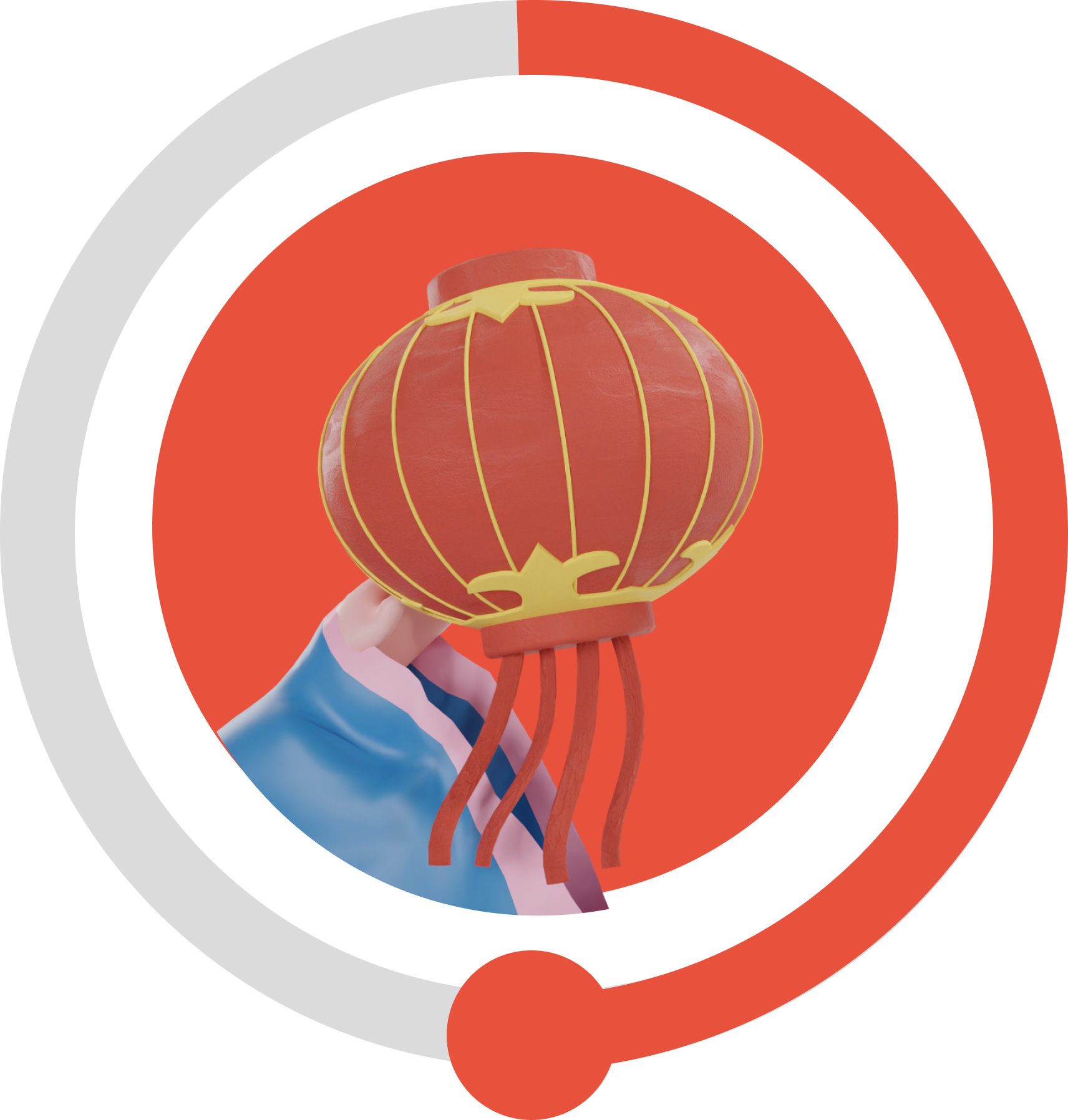
Into Saigon Market
Local traditional markets have been part and parcel of Vietnamese culture. While facing downsizing and disbandment, the Saigon traditional markets retain their role as gateways into the deeper layers of local culture.
In this context, 'Into Saigon Market' emerges as a multi-channel campaign that promotes tourism in lesser-known local markets. By integrating gamification mechanism and emerging technology throughout the touchpoints, the campaign creates an authentic and captivating experience for tourists.
By transforming lesser-known Saigon markets into tourist-driven attractions, the campaign supports the sustainable development and positioning them as invaluable cultural assets.
This project has been recognised with a Gold Award at WBDS Student Design Awards 2024/25↗ and a Bronze Award at Young Ones Student Awards 2025↗.
Full case study on Behance↗.
Promotional Video
Examine The Situation
This project emerges from our interests in cultural loss and social paradox. As the city goes through major developments, many local traditional markets are being disbanded, others moved and downsized.
After the pandemic, although socio-economic activities have returned, the
trading situation in many markets such as Ba Chieu, Ben Thanh, An Dong... is still sluggish. Many small businesses continue to hang signs to transfer and rent stalls. This signaled the decline of the traditional market model.
After the pandemic, although socio-economic activities have returned, the
trading situation in many markets such as Ba Chieu, Ben Thanh, An Dong... is still sluggish. Many small businesses continue to hang signs to transfer and rent stalls. This signaled the decline of the traditional market model.
Solution
The heart of the project is driven by the research question:
"How can a design project help preserve and promote cultural identity of traditional markets in Saigon?"
In the intersection of sustainability, cultural identity, and tourism, “Into Saigon Market” emerges as a multi-channel campaign that transforms the lesser-known Saigon markets into tourist-driven attractions.
Dynamic Branding
The logo is a playful combination of letter forms of sans serif and script typeface. By visually connecting the dots and resembling a trail, the logo effectively communicates the essence of the campaign, capturing the idea of transitioning from one market to another as part of the overall experience.

3D Assets
One of the key ideas of the project is to introduce curated route with different themes into Saigon local markets.
For the span of this course, we work with 3 themes which represent Saigon culture significantly: spiritual, fabric, and florist. For each of the route, 3D assets were created accordingly based on extensive research.
For the span of this course, we work with 3 themes which represent Saigon culture significantly: spiritual, fabric, and florist. For each of the route, 3D assets were created accordingly based on extensive research.
Spiritual Market


Fabric Market


Flower Market


Character Design
One unmissable trait of Saigon local markets are the vendors there. The way they dress and go on with daily
activities offer a sight into local habits and lifestyle.
Spiritual Vendor
For the first character in spiritual market, Dũng wants to bring in a familiar image of local women and the way they dress. The vendors here are usually middle-aged women wearing
the iconic Vietnamese pyjamas (also known as “đồ bộ” while flexing their gold bracelets (also known as “ximen”).


Fabric Vendor
In contrast to spiritual route, fabric market
carries a more bustling atmosphere as the vendors constantly importing and
exporting fabric and garments. The typical scene to see here is strong,
young men carrying fabric rolls on 1 shoulder. Most of the time, they don’t even
have time to take off their helmets since they are always on the go, ready to get on
their motorbikes to deliver the next order.


Florist Vendor
In florist markets, oftentimes, you can see mostly the women being the breadwinner. Because of a busy lifestyle constantly exposed to the heat of Saigon, they are often seen wearing a
loose shirt outside as a jacket.
However, they still has an interesting way to take care of and beautify themselves in public by wearing hair rollers, which exudes their comfortable, casual, and rustic attitude.


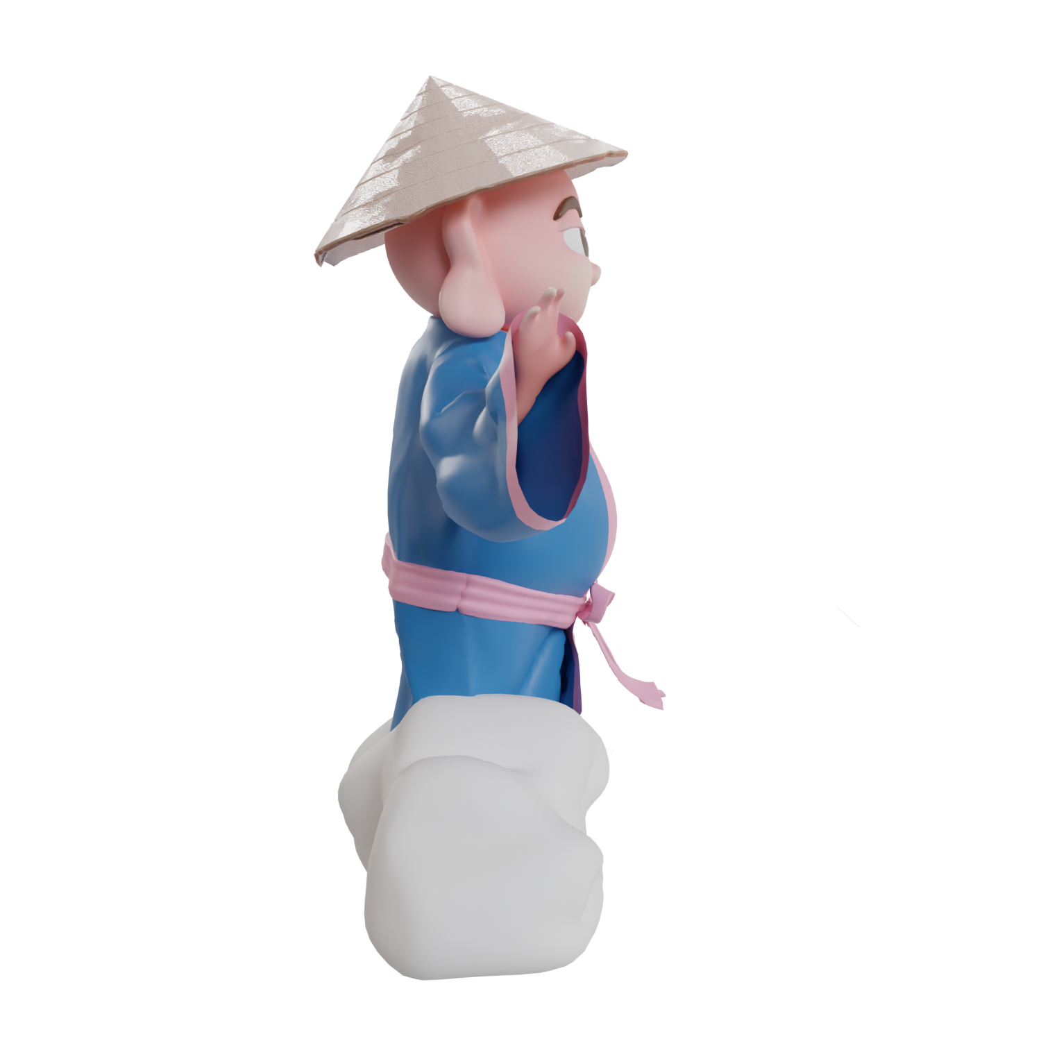
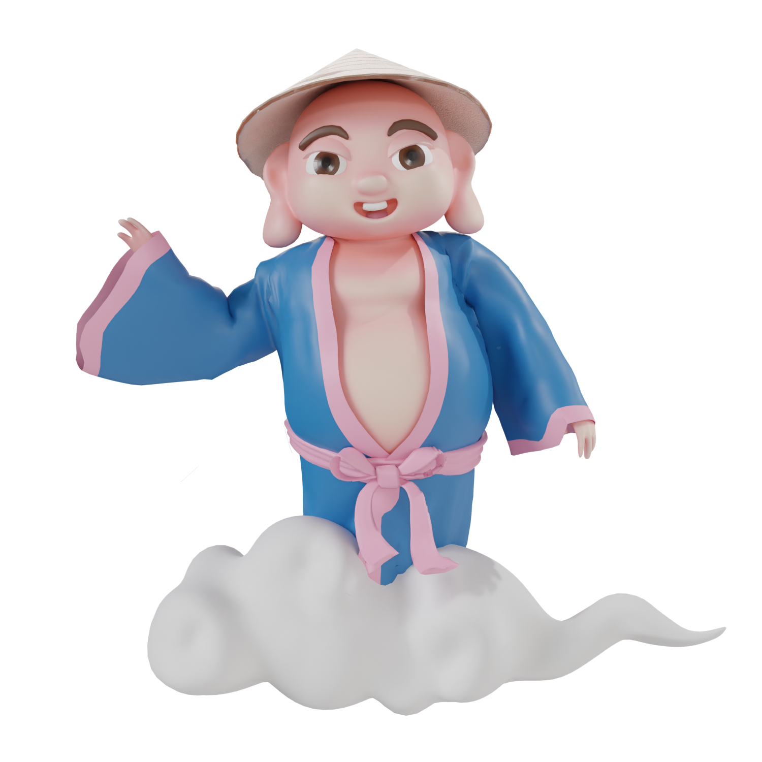
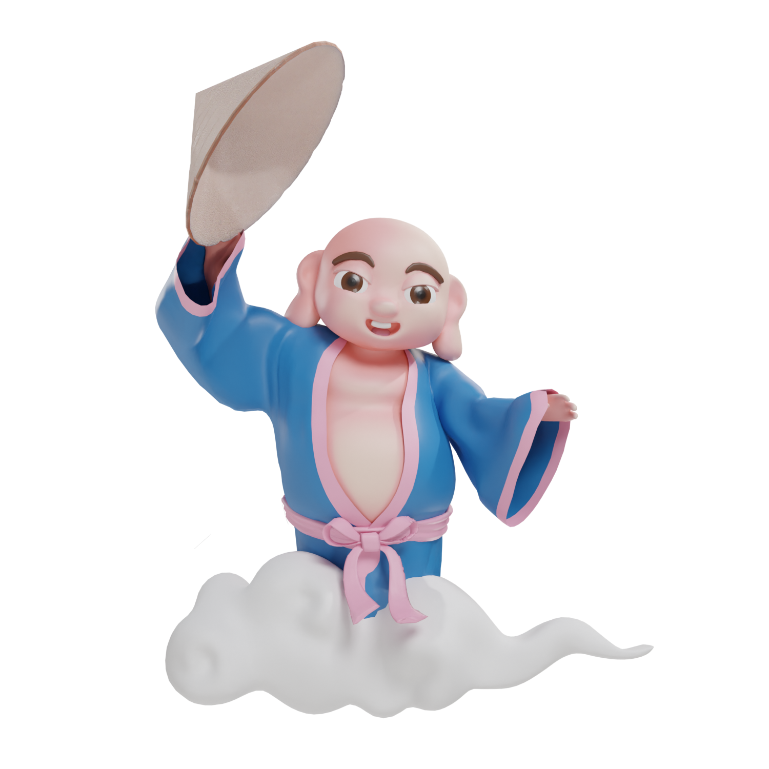
Mascot Design
The AR Companion also serves as the mascot of the campaign. Inspired by Land Genie (ông Địa),
a Vietnamese god who is knowledgeable about navigation and local neighbourhood, the character
design aims to represent the local deity in a
contemporary lens.
There were many depictions of Vietnamese Land Genie; however, they share common characteristics: long ears and big belly. At the same time, Land Genie must be friendly and approachable; therefore, a stylized approach is introduced with rounded forms.
contemporary lens.
There were many depictions of Vietnamese Land Genie; however, they share common characteristics: long ears and big belly. At the same time, Land Genie must be friendly and approachable; therefore, a stylized approach is introduced with rounded forms.


Campaign Breakdown
To demonstrate the user journey and how the touchpoints come into interactions with the tourists, we broke down the campaign into 3 main phases: Before-trip, On-site, and After-trip.
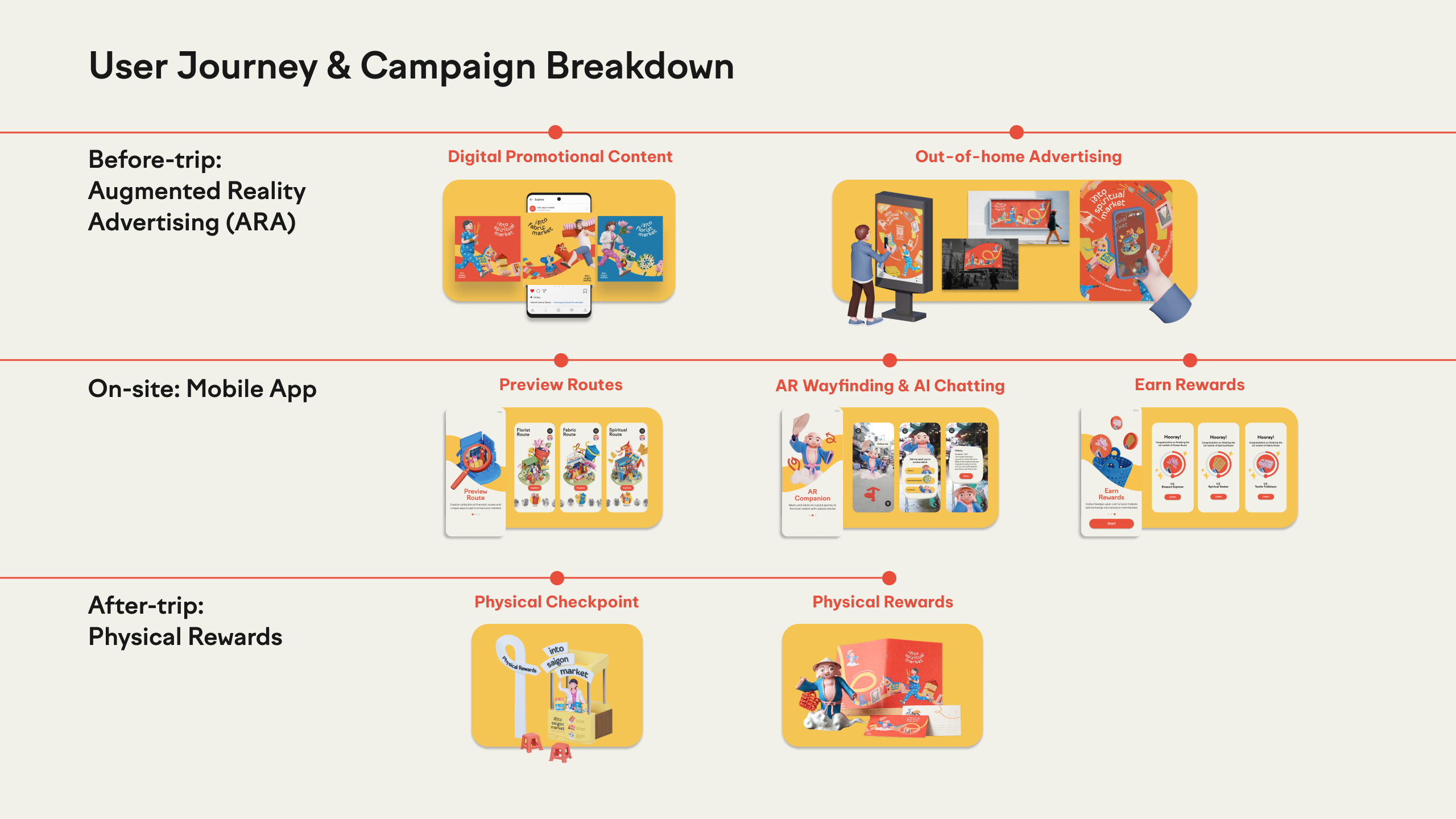
Before-Trip: First Touchpoint: Augmented Reality
Advertising (ARA)
The first touchpoint of the journey was designed to trigger the curiosity of the tourists. Augmented Reality Advertising (ARA) is integrated to digital billboards, posters, and social
posts to approach the contemporary tourists - who are tech-savvy and spend lots of time online.
This approach allows the campaign to reach potential audience from all around the world. The goal for this stage is to preview the routes and download app.
This approach allows the campaign to reach potential audience from all around the world. The goal for this stage is to preview the routes and download app.
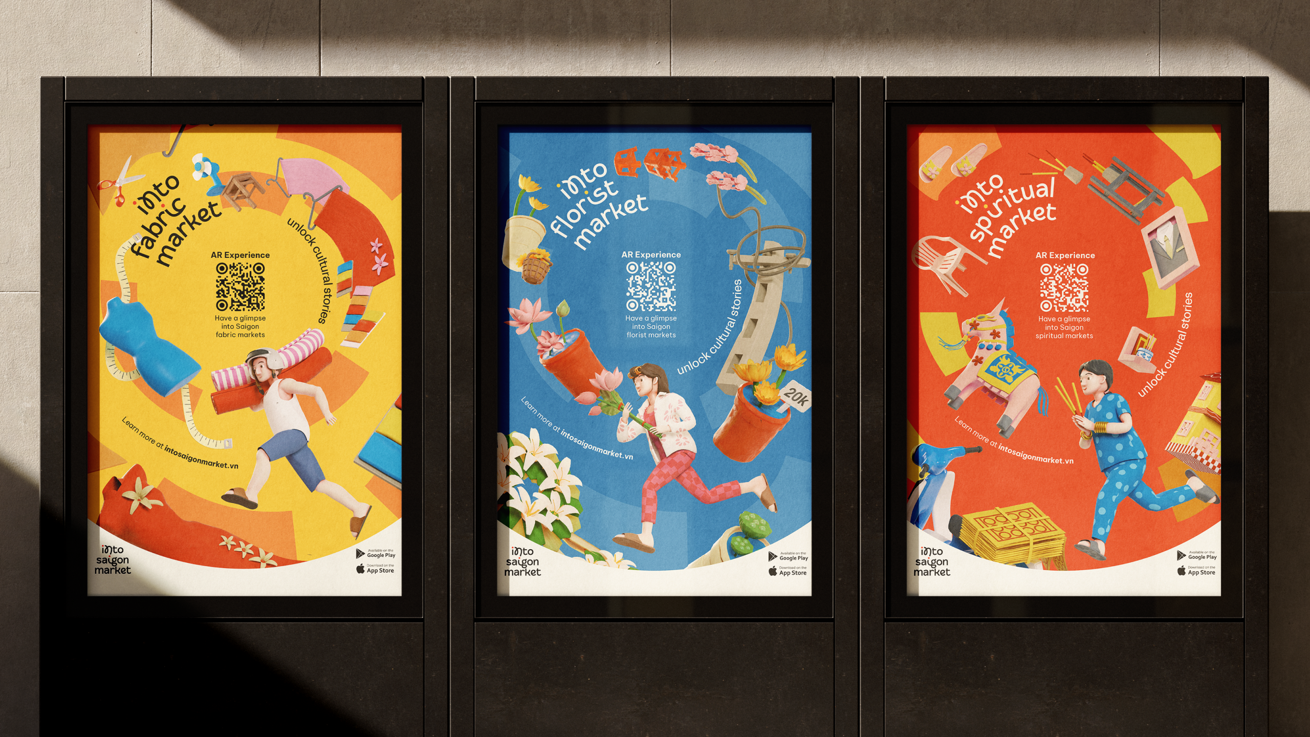

Scenario for ARA
The ARA experience contains 2 components:
1. The advertising posters
2. Overlay 3D elements when scanning the QR code with your phone
1. The advertising posters
2. Overlay 3D elements when scanning the QR code with your phone

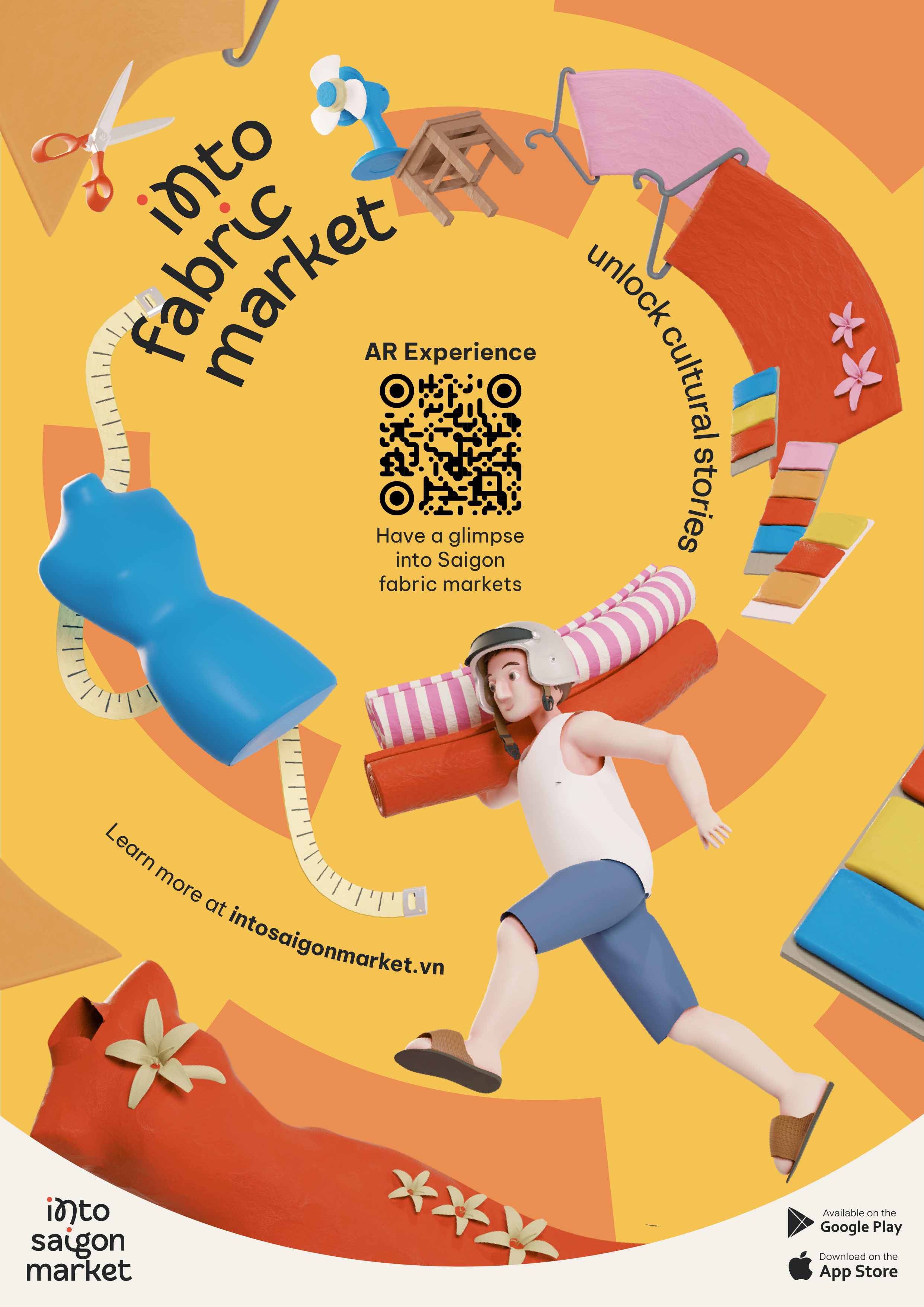
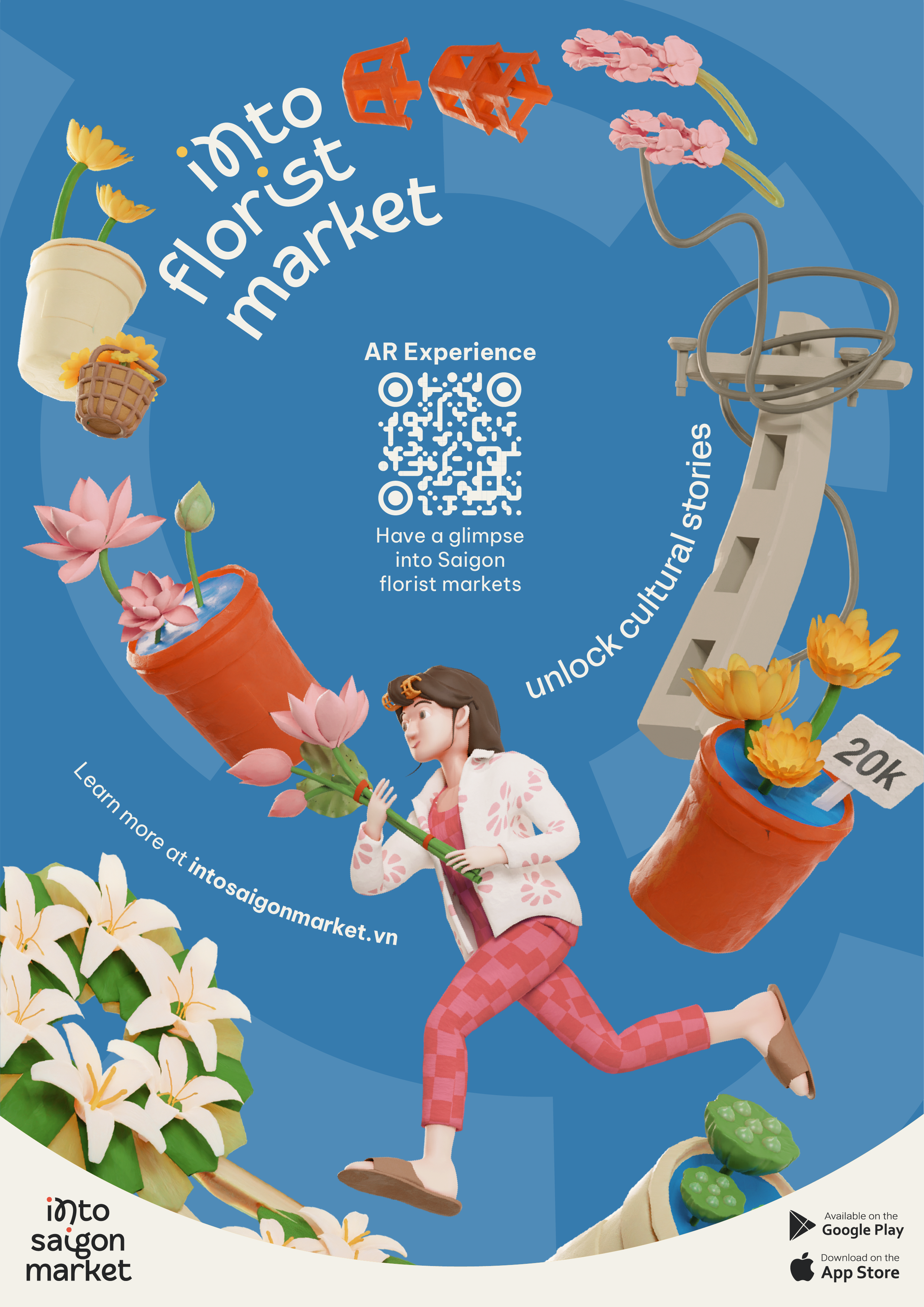


AR Experience - How it works
1. Scan to link to AR Instagram Filter
2. Look for the poster as the trigger
3. Use 2 fingers to interact with the 3D object
1. Scan to link to AR Instagram Filter
2. Look for the poster as the trigger
3. Use 2 fingers to interact with the 3D object
On-site: App
Sitemap
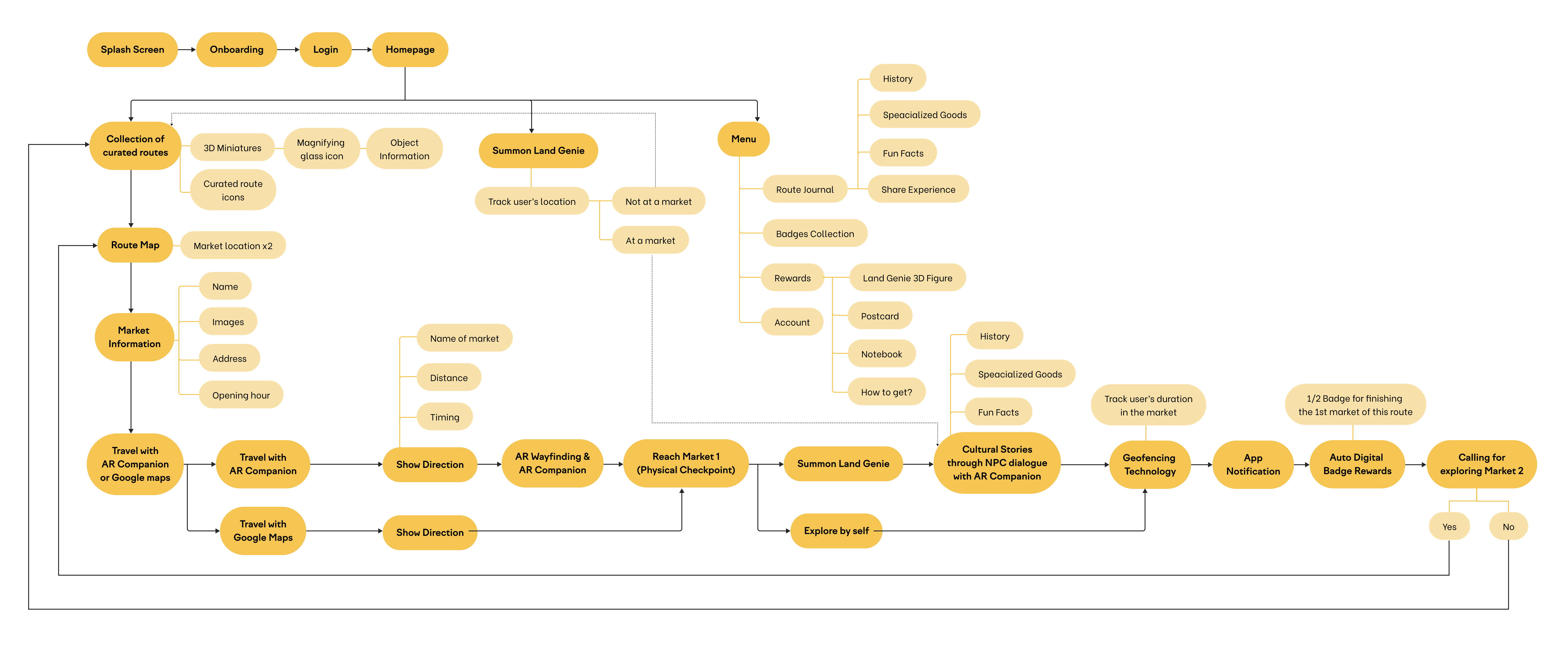
Preview the themed routes
Once they download the app, they are welcomed by curated routes with different themes by interacting with 3D miniatures. This phase allows the tourists to preview the destination in advance to see what
suits them.
AR Mode to Summon Land Genie
The app introduces an AR Mode
that connects the tourists to our beloved Land Genie, the AR
Companion and assistant.
For now, you can tap the button to Summon Land Genie to help you
navigate the way to the markets
and have conversation with it through prompts and dialogue tree
game mechanic.
After-Trip: Reward System
To maintain the tourists’ interest
and encourage them to finish the routes, we introduce a rewards
system consisting of digital
badges and physical merchandise.
Digital Badges
Each route has a badge as a reward
to users. As each route has 2 markets, we have a progressing circle for users to track their progress. This serves as a motivation to explore all markets.


Physical Rewards
While digital badges are automatically
rewarded to users using location sensor
technology upon completing their visit to a local market, the physical merchandise require a certain number of badges to exchange at the checkpoints.
technology upon completing their visit to a local market, the physical merchandise require a certain number of badges to exchange at the checkpoints.


Exhibition Booth

Design Document

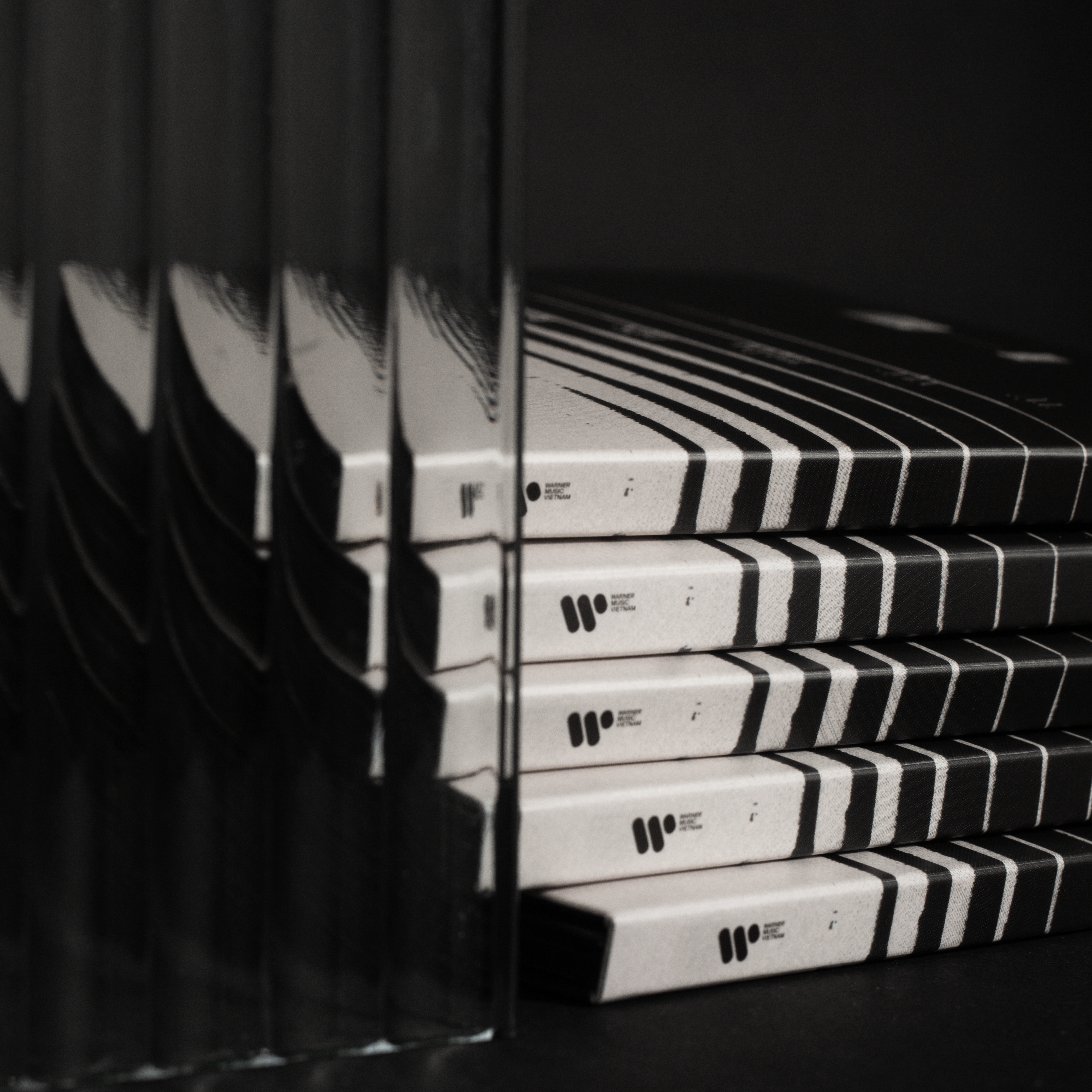
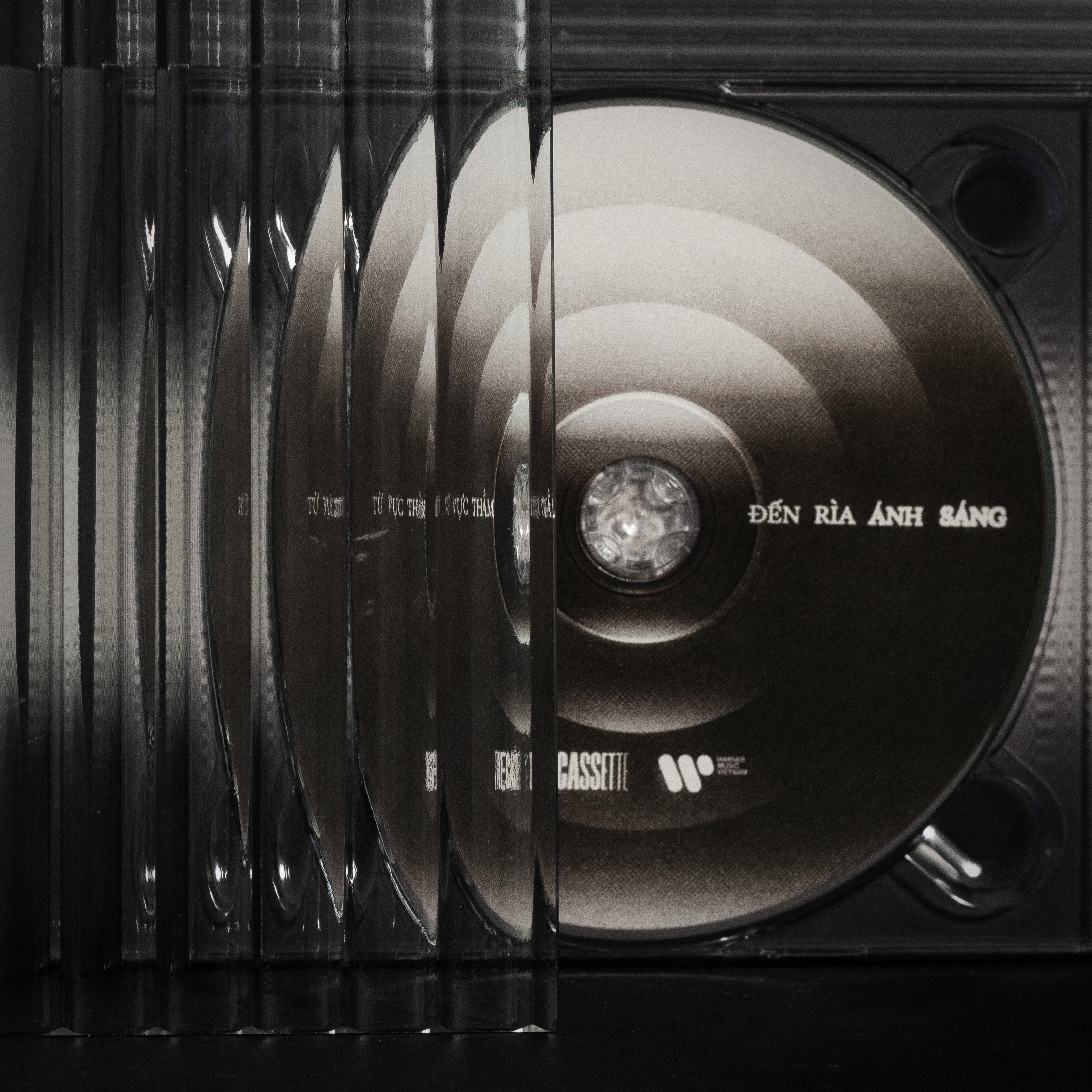
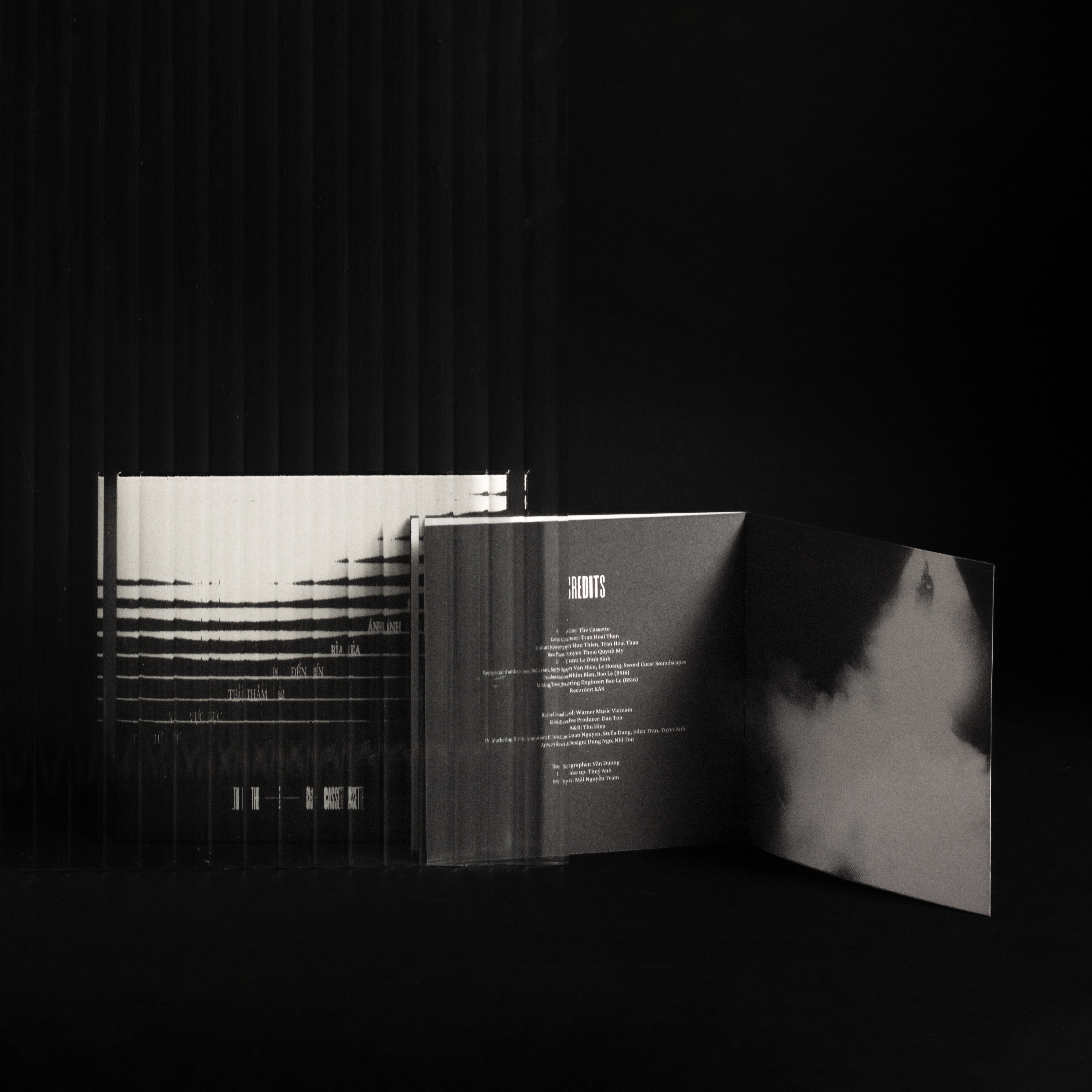
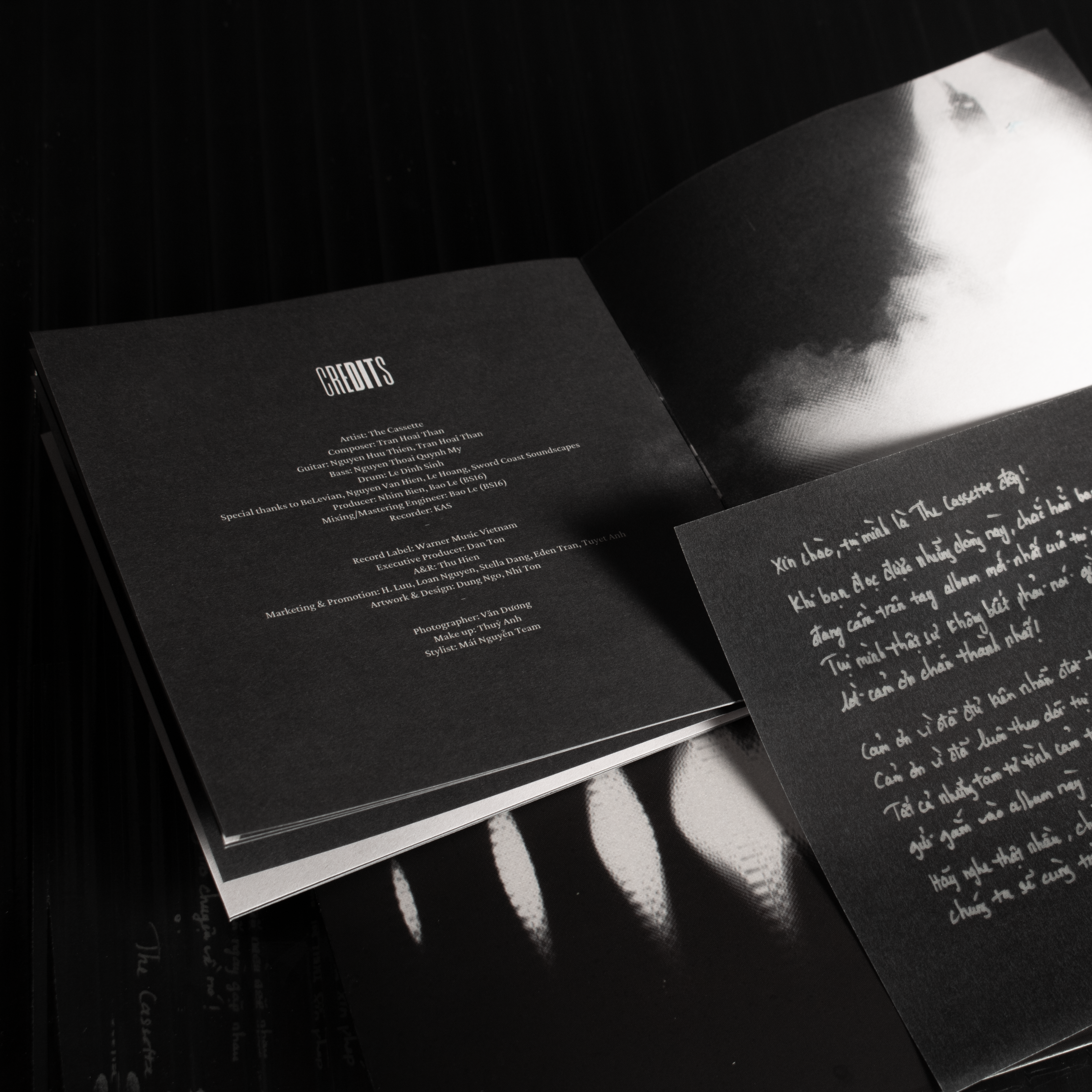
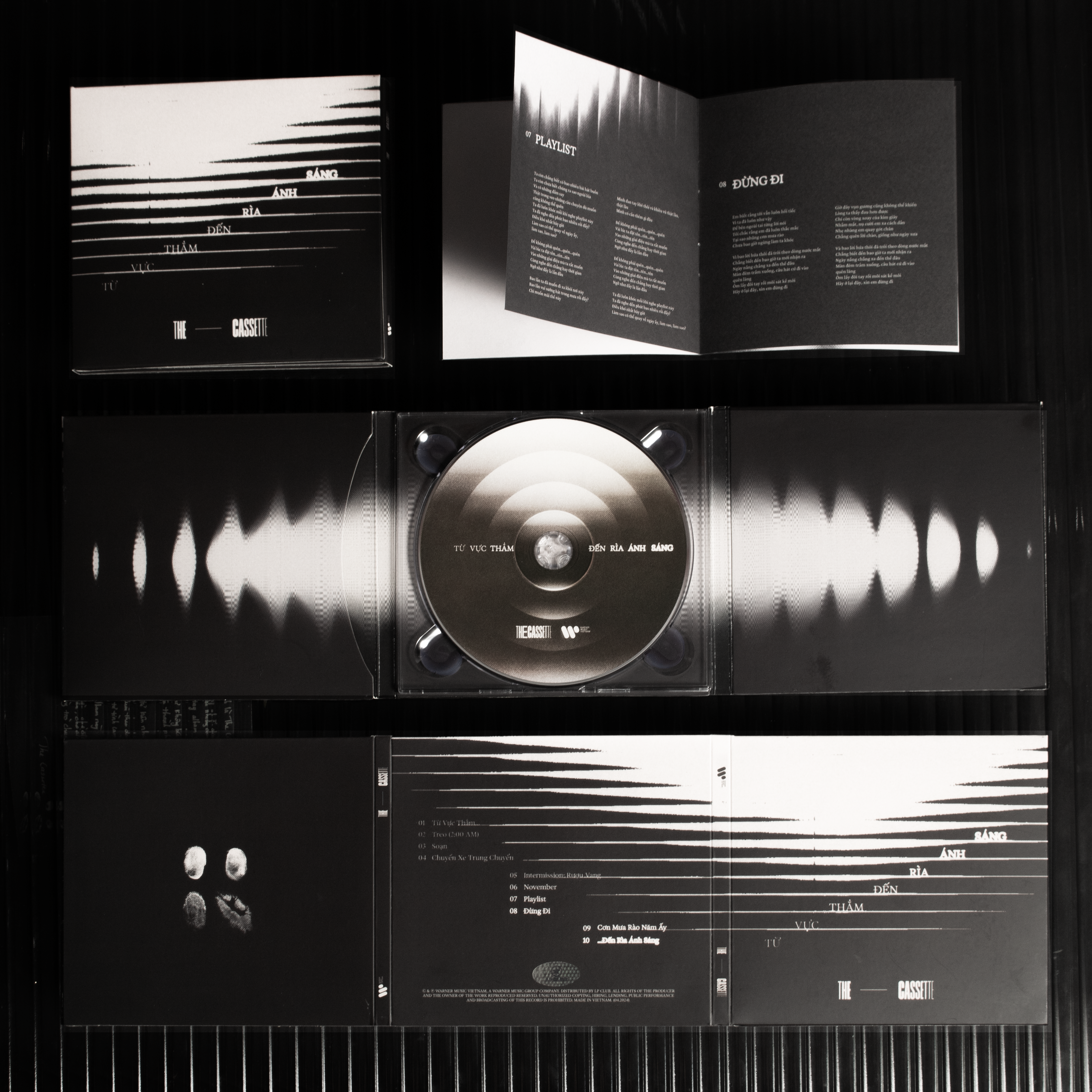
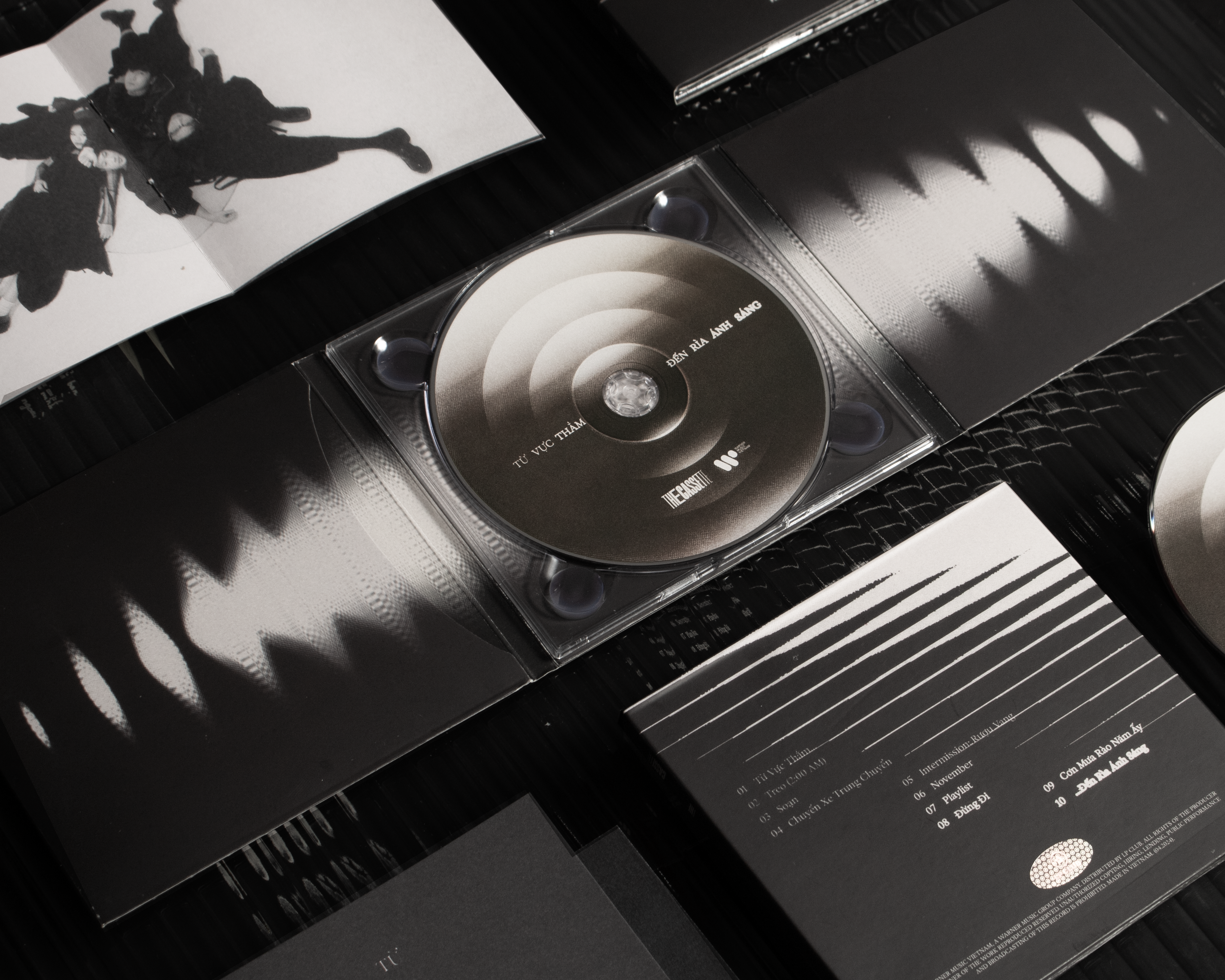
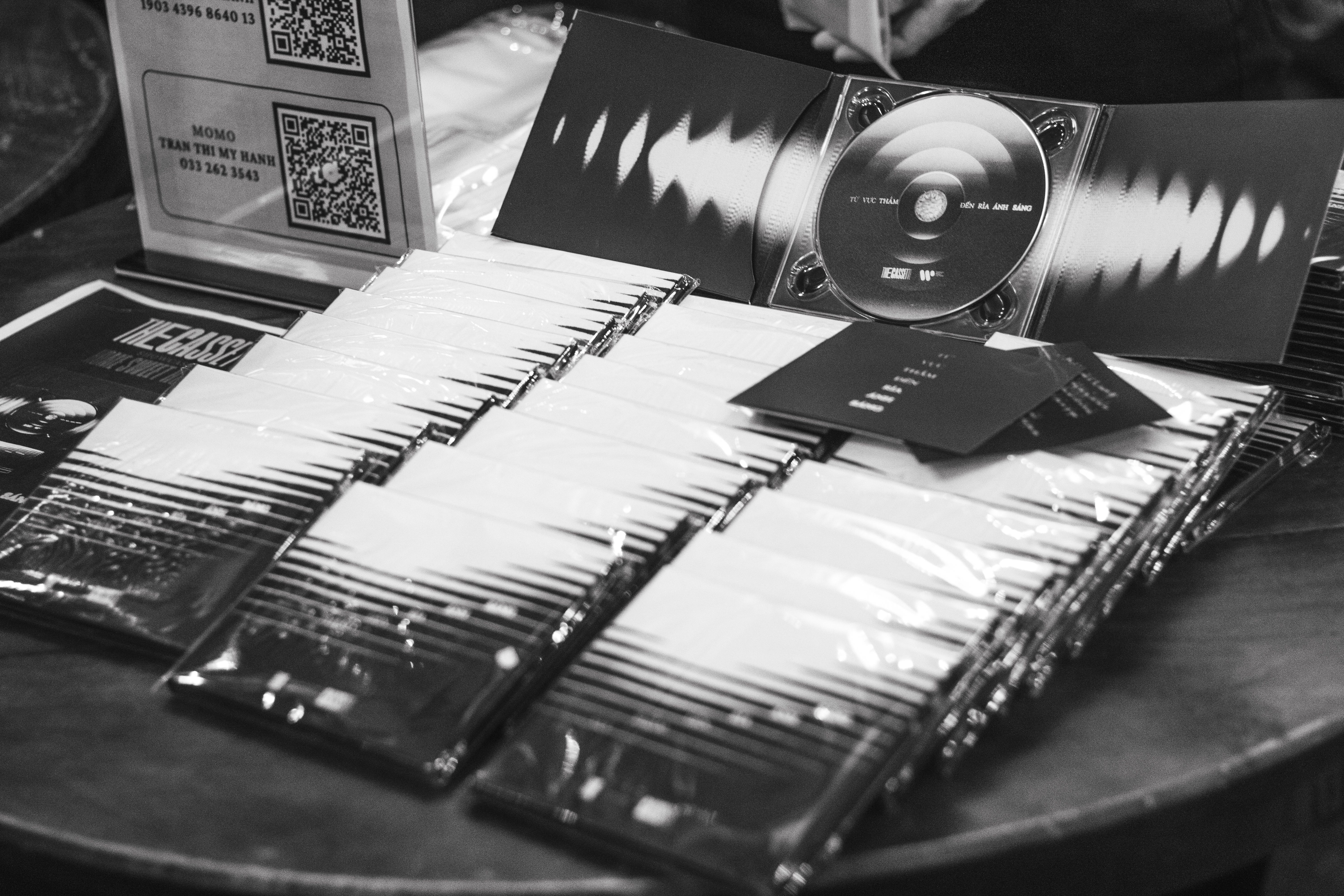
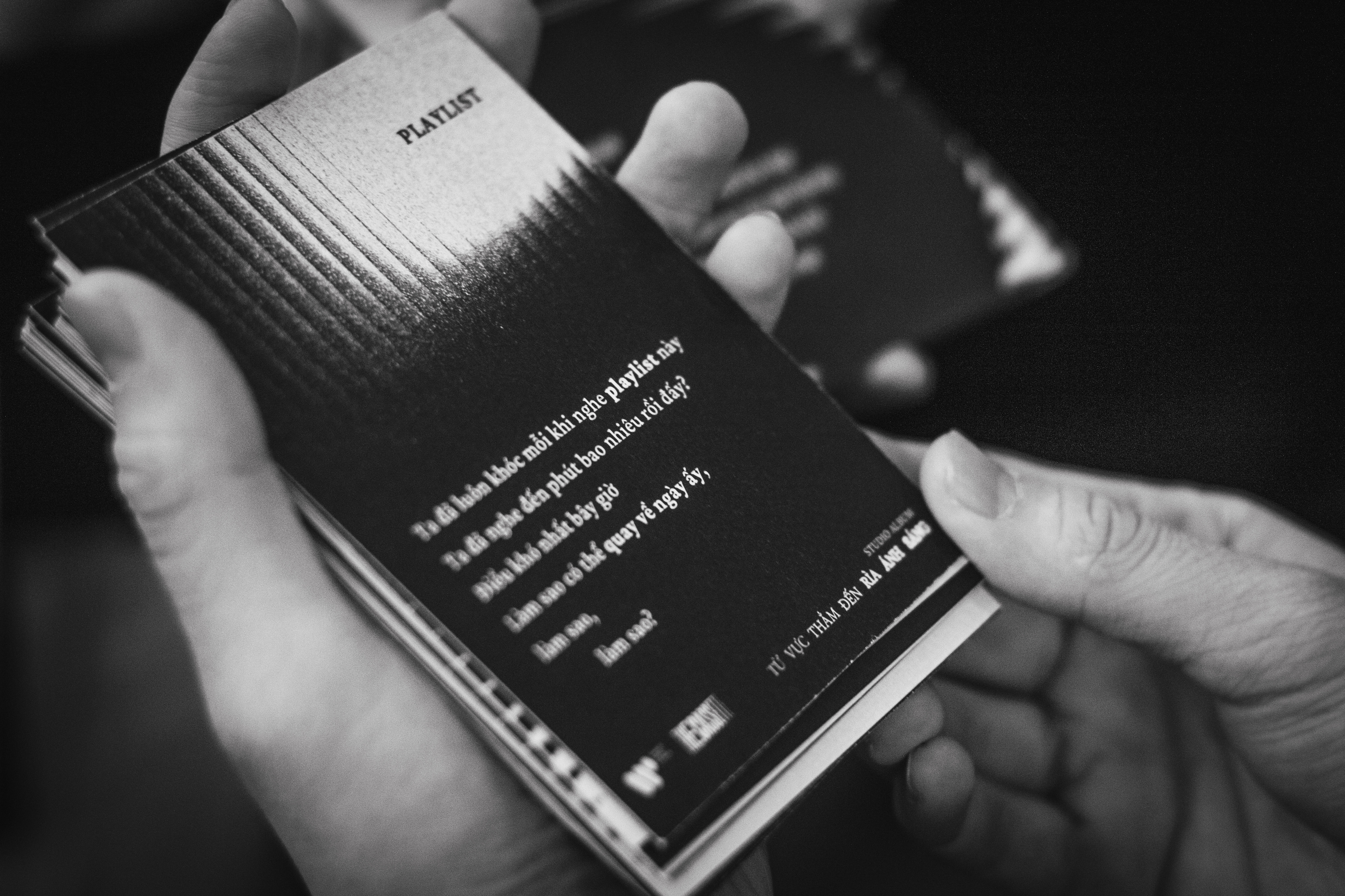
The Cassette - Tu Vuc Tham Den Ria Anh Sang
MoiCentered around the abstract tension and the contrast of black and white values, the visual identity of The Cassette’s sophomore album unfolds across all touchpoints: from the physical CD packaging to audio-reactive visualizers, editorial, and product photography. Each element is arranged dynamically to channel the album’s themes of struggle and awakening, crafting a cohesive and immersive identity.
Year
2024
Scope of Work
Art Direction, Typography, Packaging Design, Product Photography, Visualizer, Event Photography
Artist
The Cassette
Composer
Tran Hoai Than
Guitar
Nguyen Huu Thien, Tran Hoai Than
Bass
Nguyen Thoai Quynh My
Drum
Le Dinh Sinh
Special thanks to BeLevian, Nguyen Van Hien, Le Hoang, Sword Coast Soundscapes
Producer
Nhim Bien, Bao Le (BS16)
Mixing/Mastering
Bao Le (BS16)
Recorder
KAS
Record Label
Warner Music Vietnam
Executive Producer
Dan Ton
A&R
Thu Hien
Marketing & Promotion
H. Luu, Loan Nguyen, Stella Dang, Eden Tran, Tuyet Anh
Artwork & Design
Dung Ngo, Nhi Ton, Nguyen Le
Special Thanks to LP CLUB.
Nhim Bien, Bao Le (BS16)
Mixing/Mastering
Bao Le (BS16)
Recorder
KAS
Record Label
Warner Music Vietnam
Executive Producer
Dan Ton
A&R
Thu Hien
Marketing & Promotion
H. Luu, Loan Nguyen, Stella Dang, Eden Tran, Tuyet Anh
Artwork & Design
Dung Ngo, Nhi Ton, Nguyen Le
Special Thanks to LP CLUB.
Physical Album Photography
Photographer
Dung Ngo
Concept & Styling
Dung Ngo
Lighting
Bam Tran
Event Photographer
Dung Ngo
Visualizer
Dung Ngo, Nhi Ton, Dinh Kha
Photographer
Dung Ngo
Concept & Styling
Dung Ngo
Lighting
Bam Tran
Event Photographer
Dung Ngo
Visualizer
Dung Ngo, Nhi Ton, Dinh Kha
Concept
The interplay between light and darkness
The album reflects a duality: part dark and mysterious, part vibrant and accessible, much like a personal diary chronicling a contrasting emotional journey. This narrative inspired me to develop a visual identity that embodies the album’s complex, dreamlike progression.

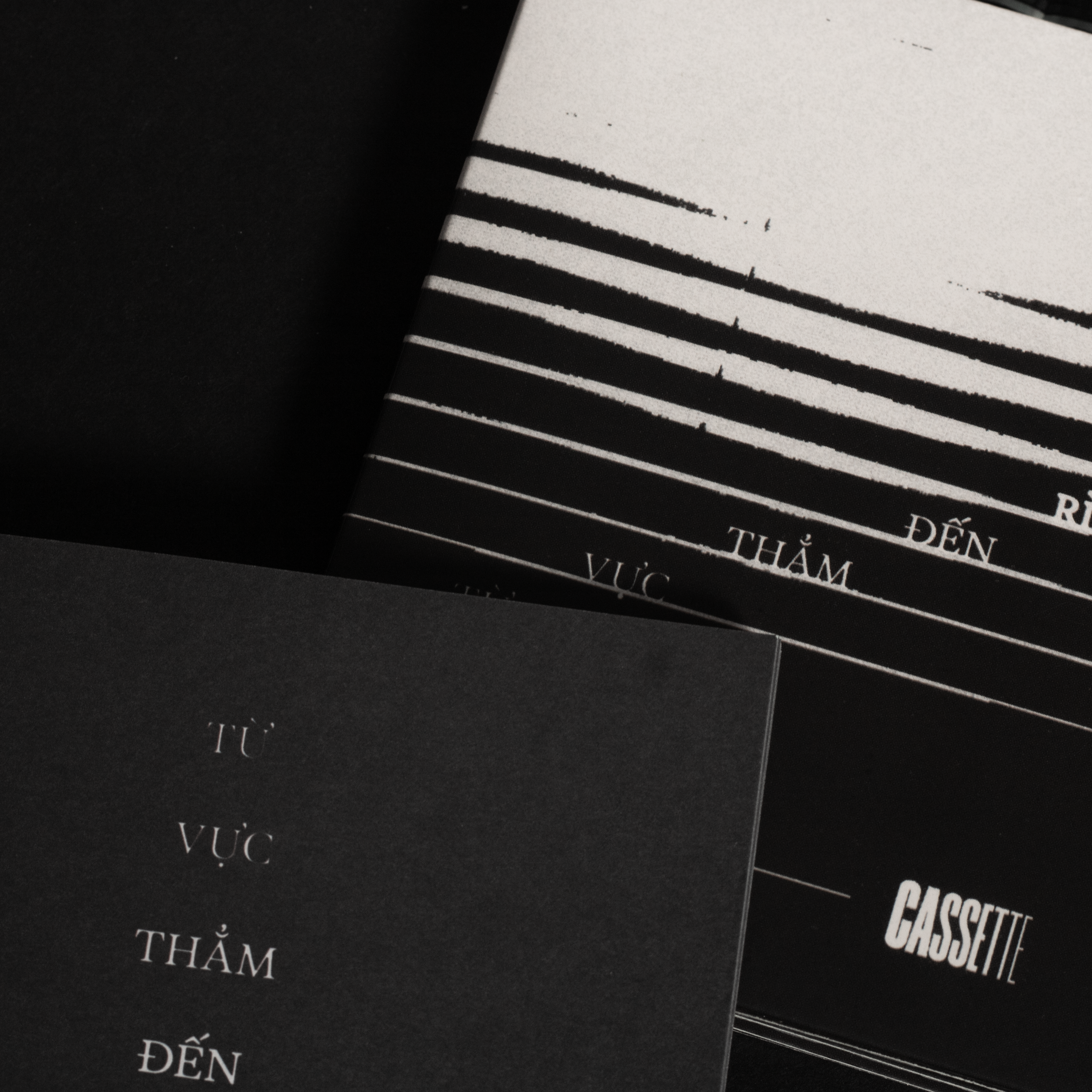
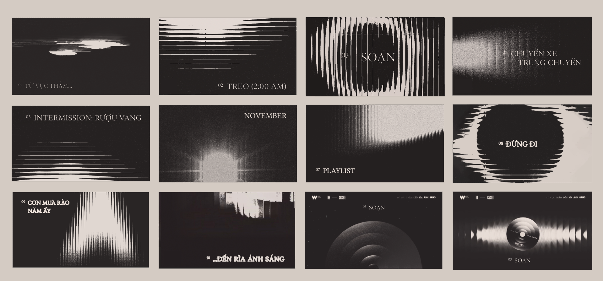
Variable Typography
Song titles were designed from the lightest weight to the boldest weight, capturing the contrast of light and darkness.
Packaging Design
The interplay between light and darkness is continued to be experimented through distortion, refraction, and transitioning effects in other items of the album packaging.

Audio-Reactive Lyric Videos
The songs were to brought to life using TouchDesigner, which creates dynamic, audio-reactive visuals. Additionally, varying font weights were employed in the lyrics to be cohesive with the packaging design.
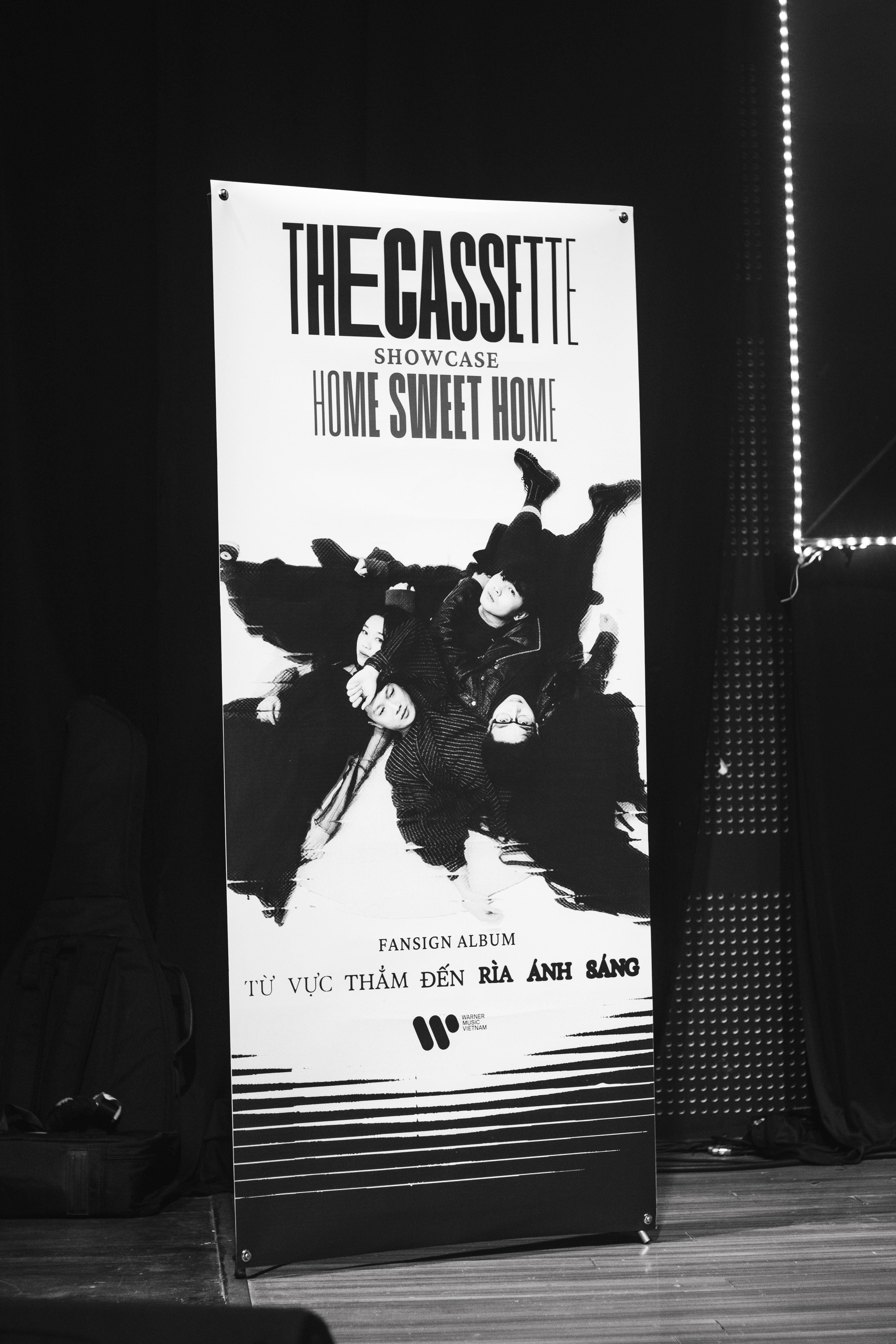
Event Photography
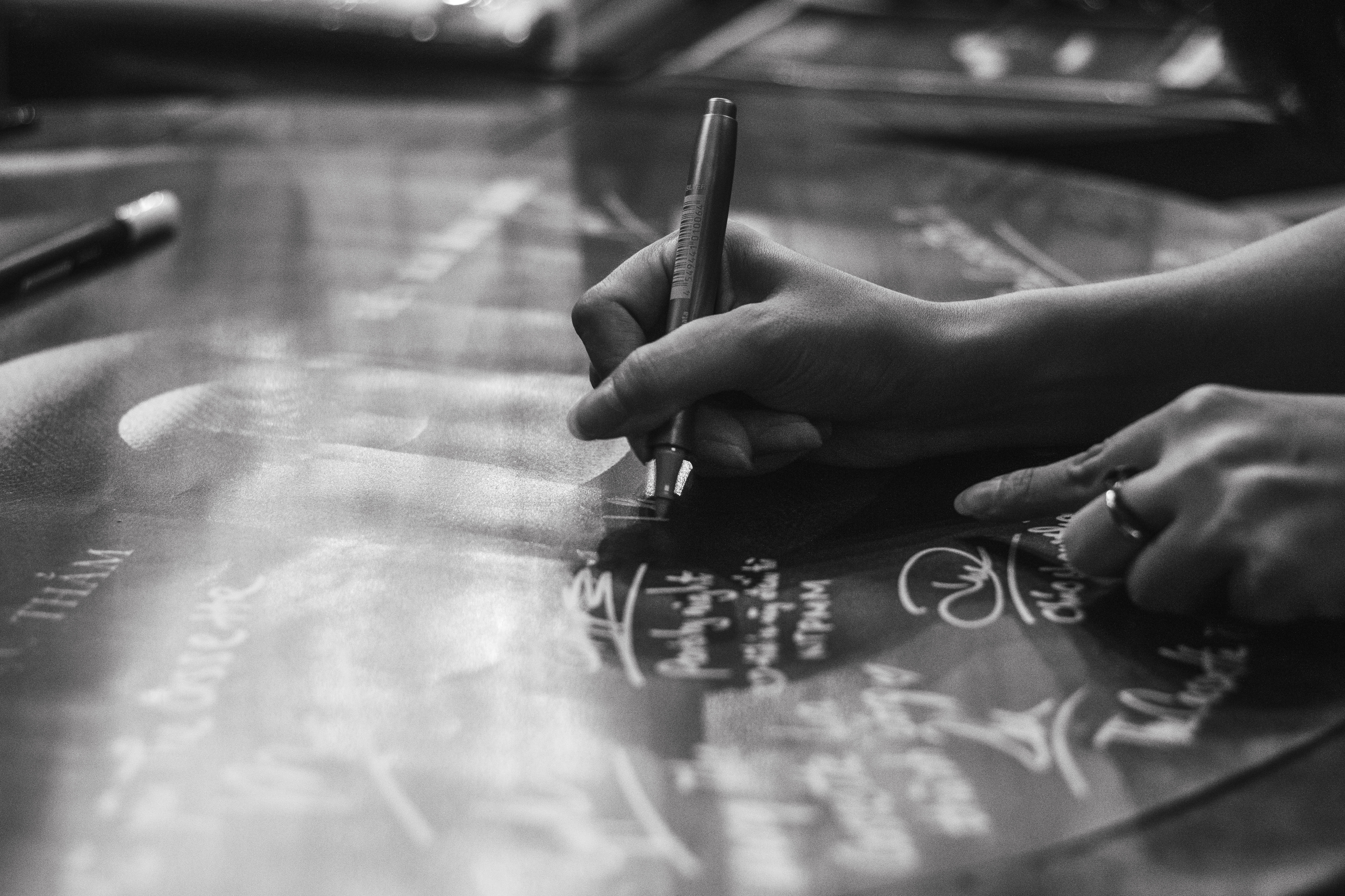
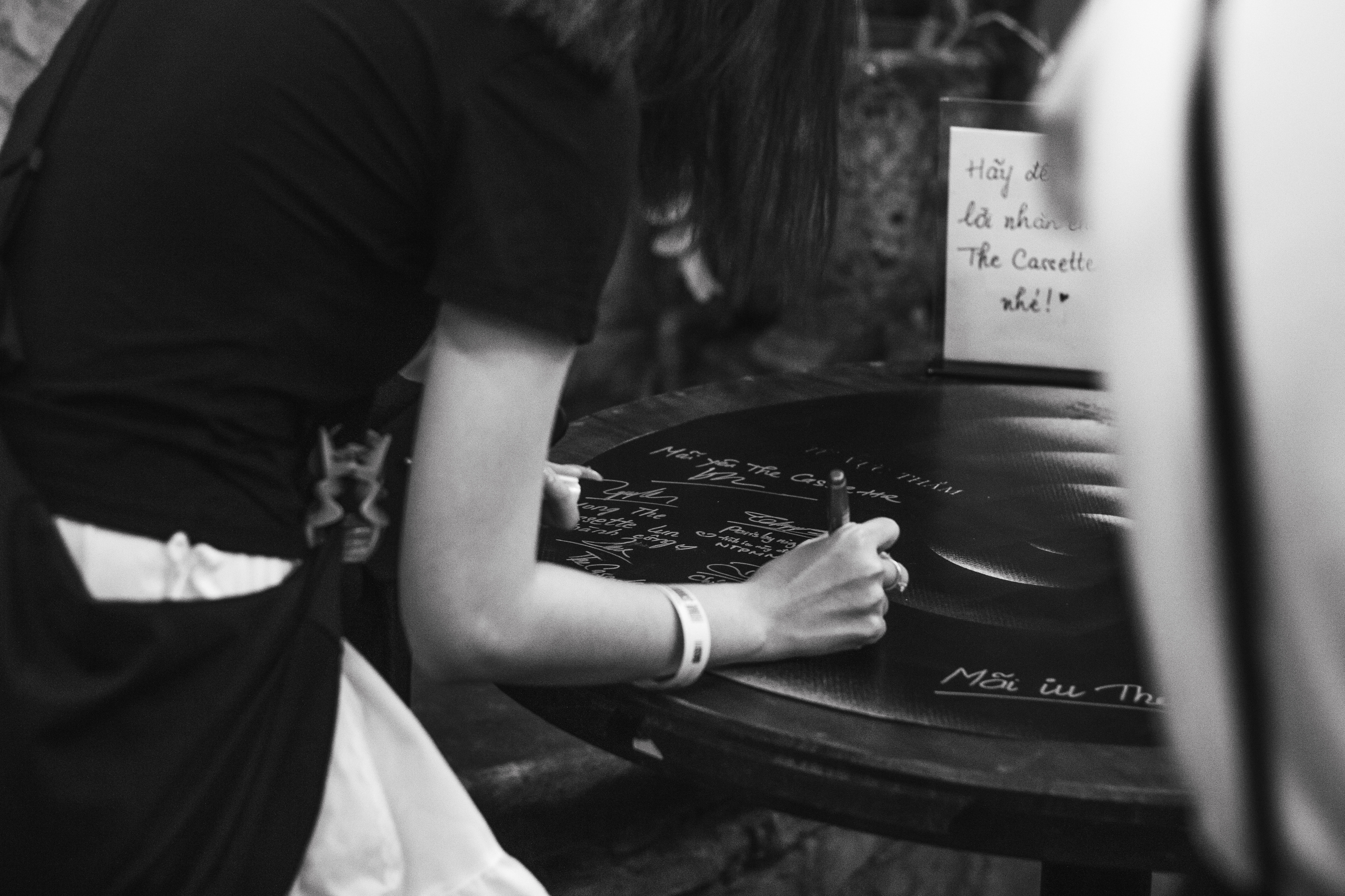
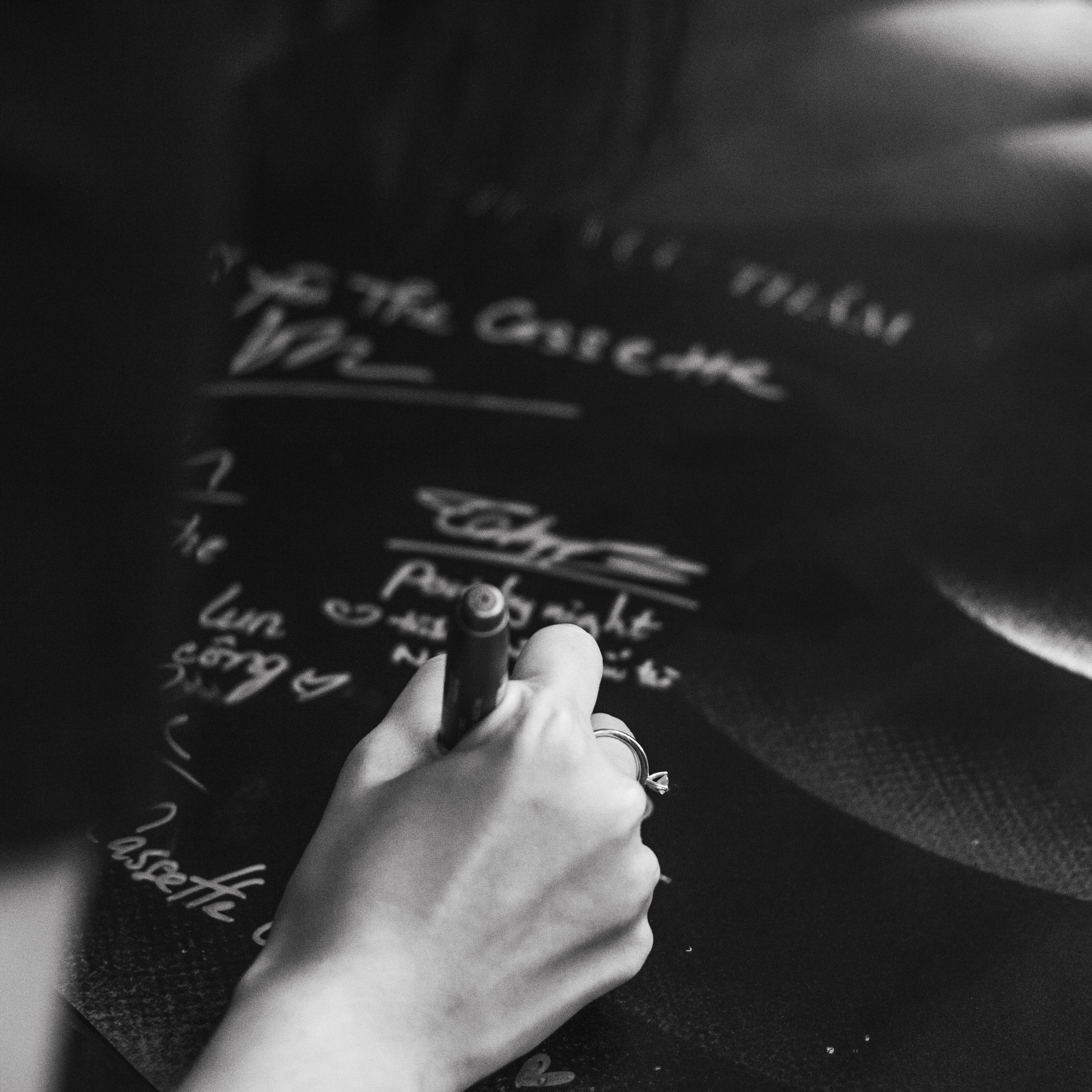
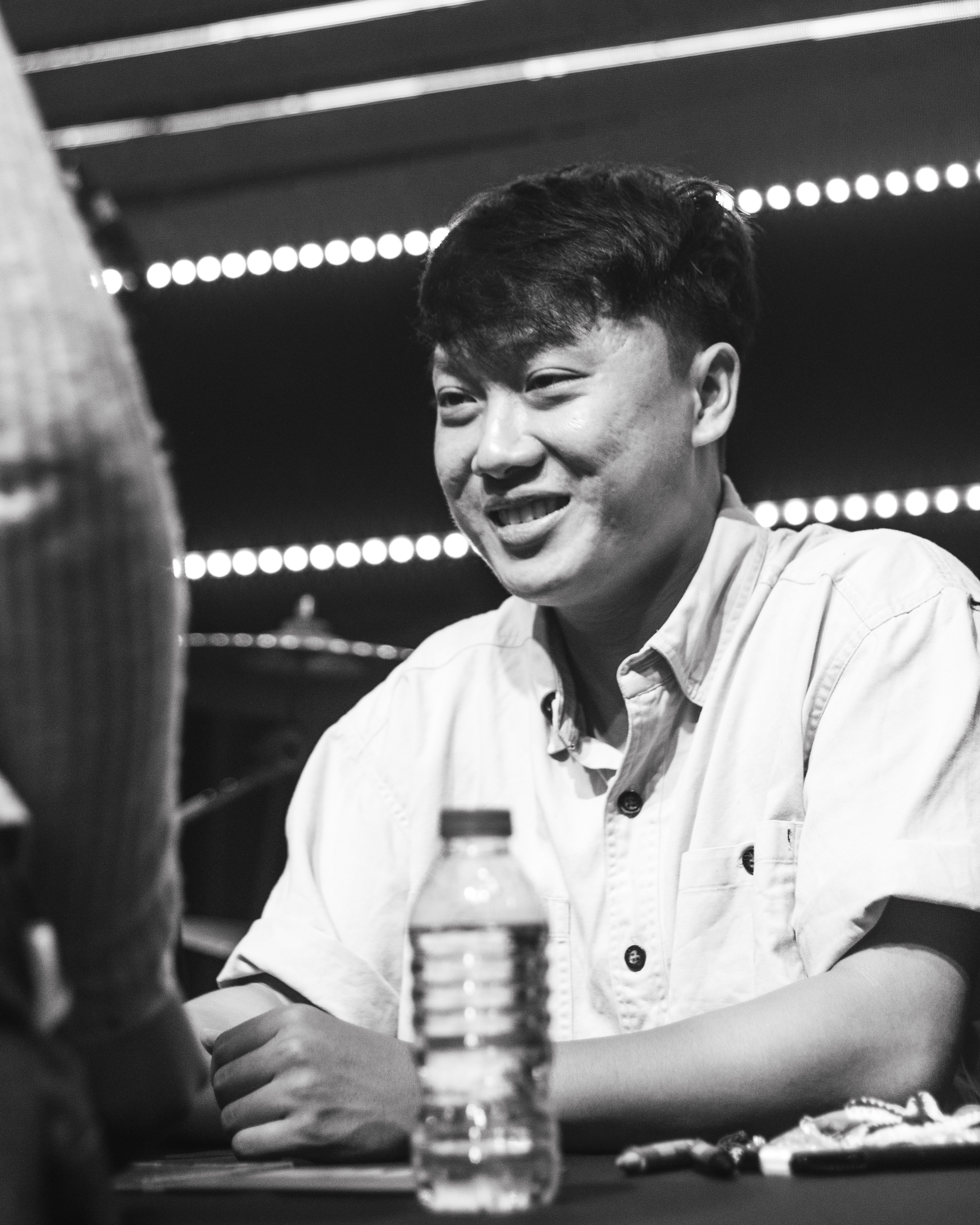
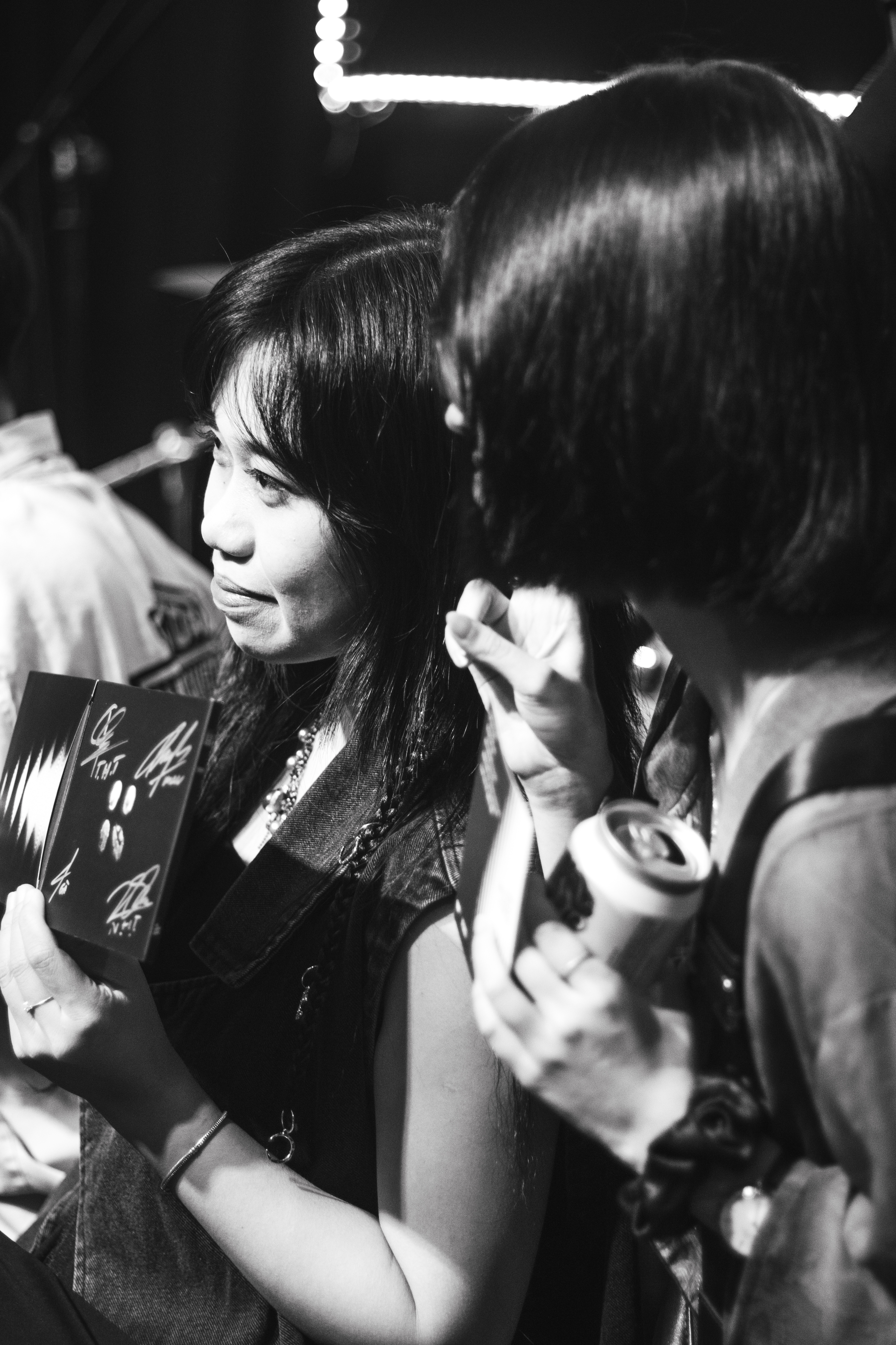
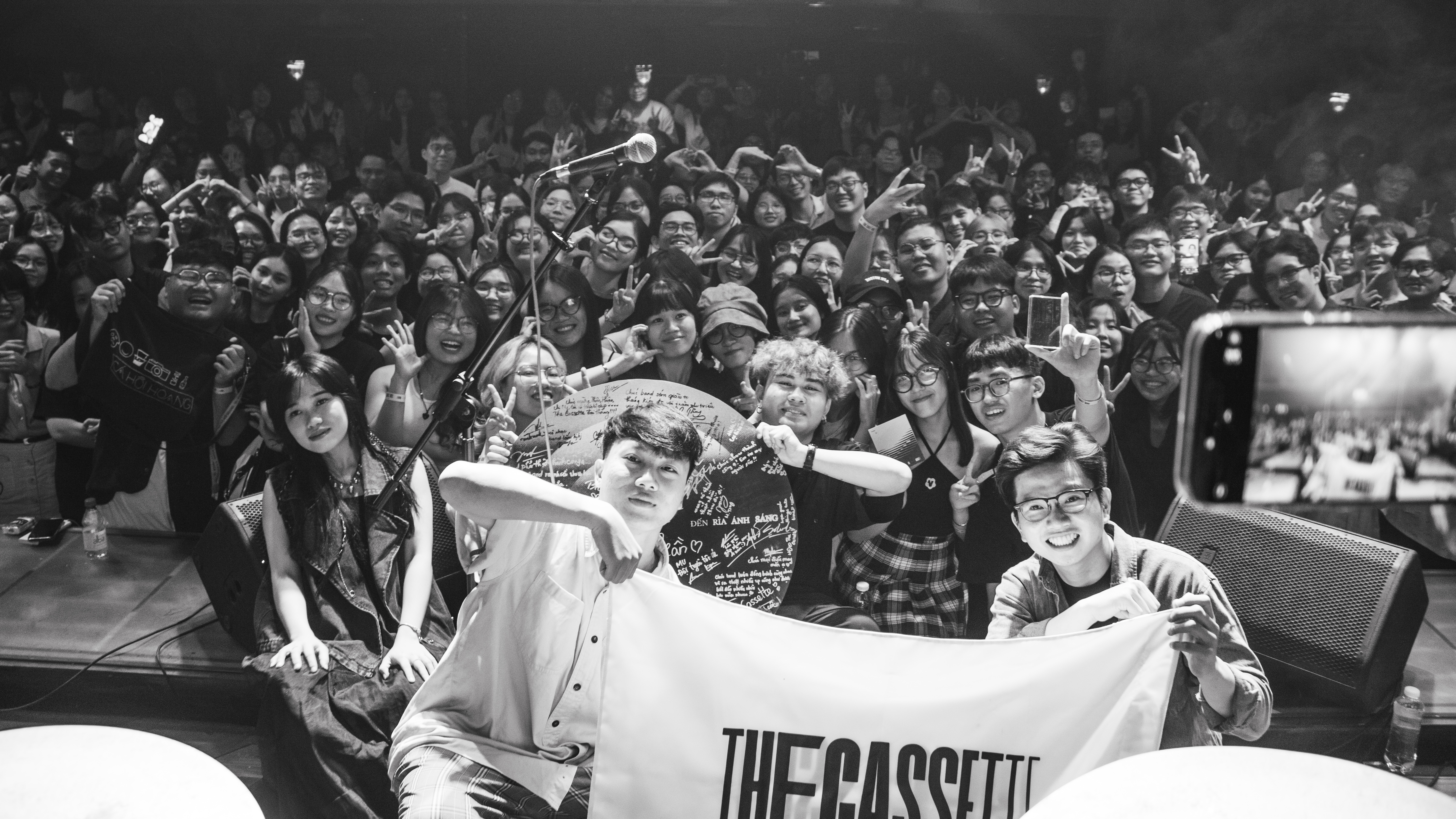
In May 2024, The Cassette’s sold-out showcase and fansign event took place in Ho Chi Minh City. Projected onto large screens and woven into venue decorations, these visual elements helped transform the band's performance into a fully immersive experience.


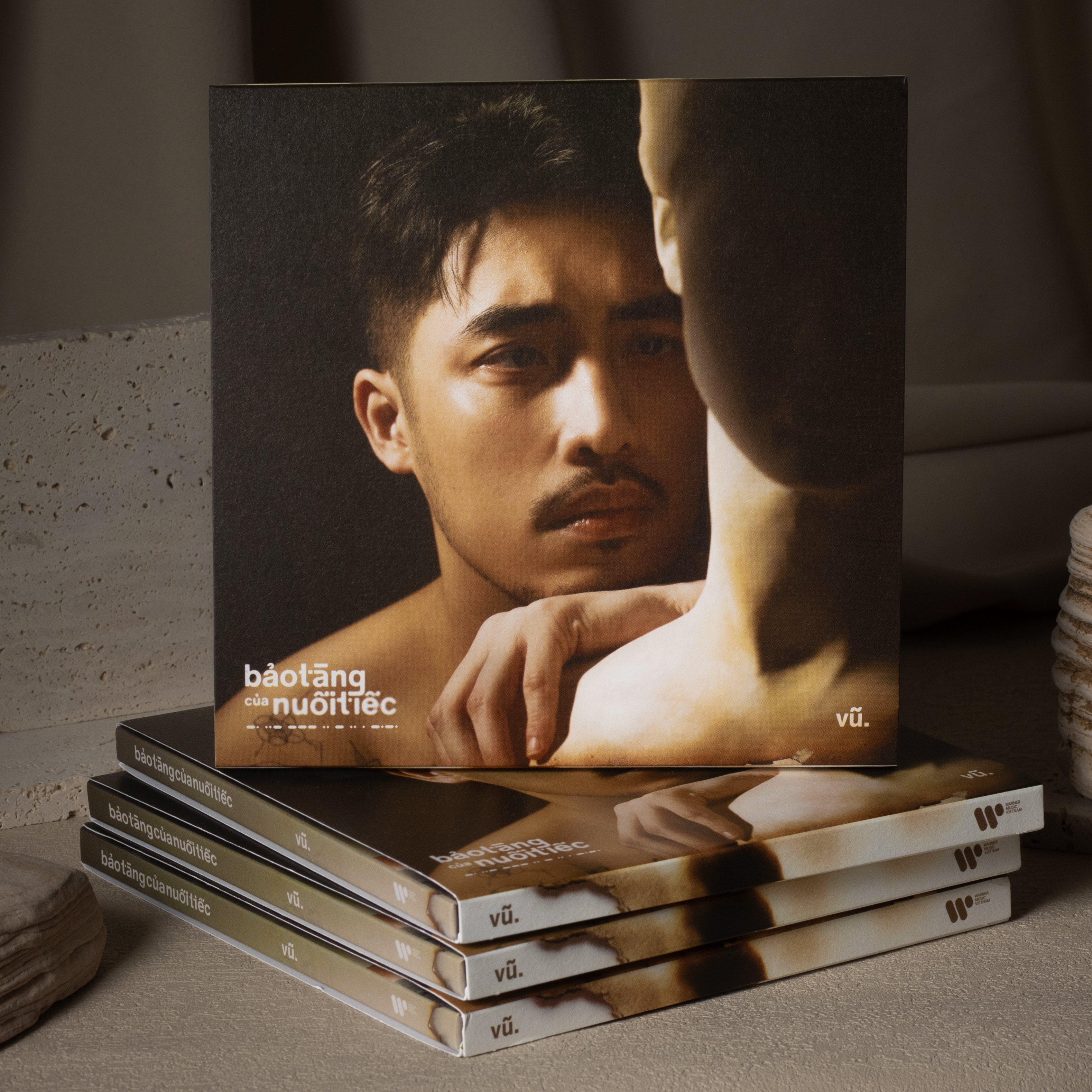
Vu. - Bao Tang Cua Nuoi Tiec
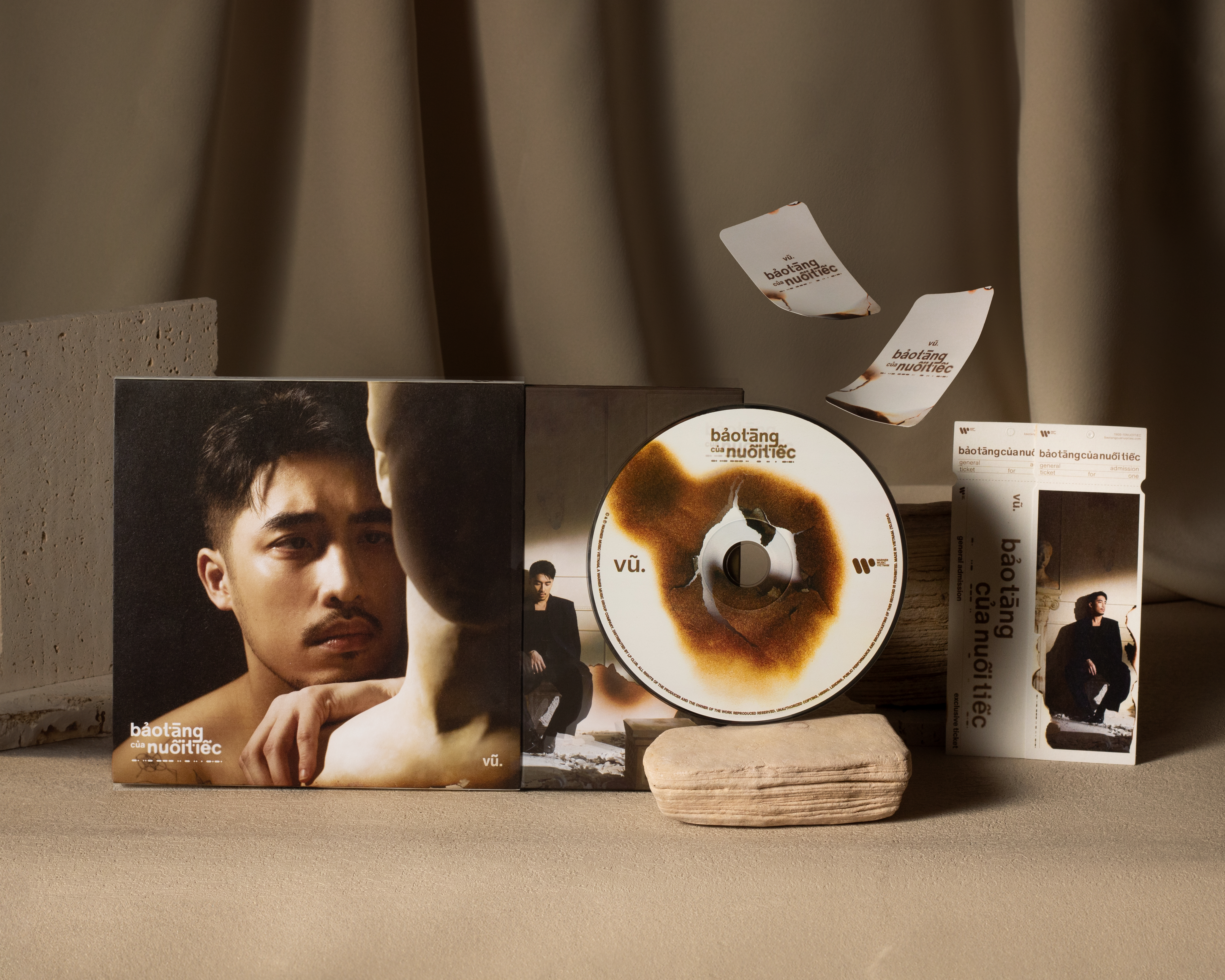
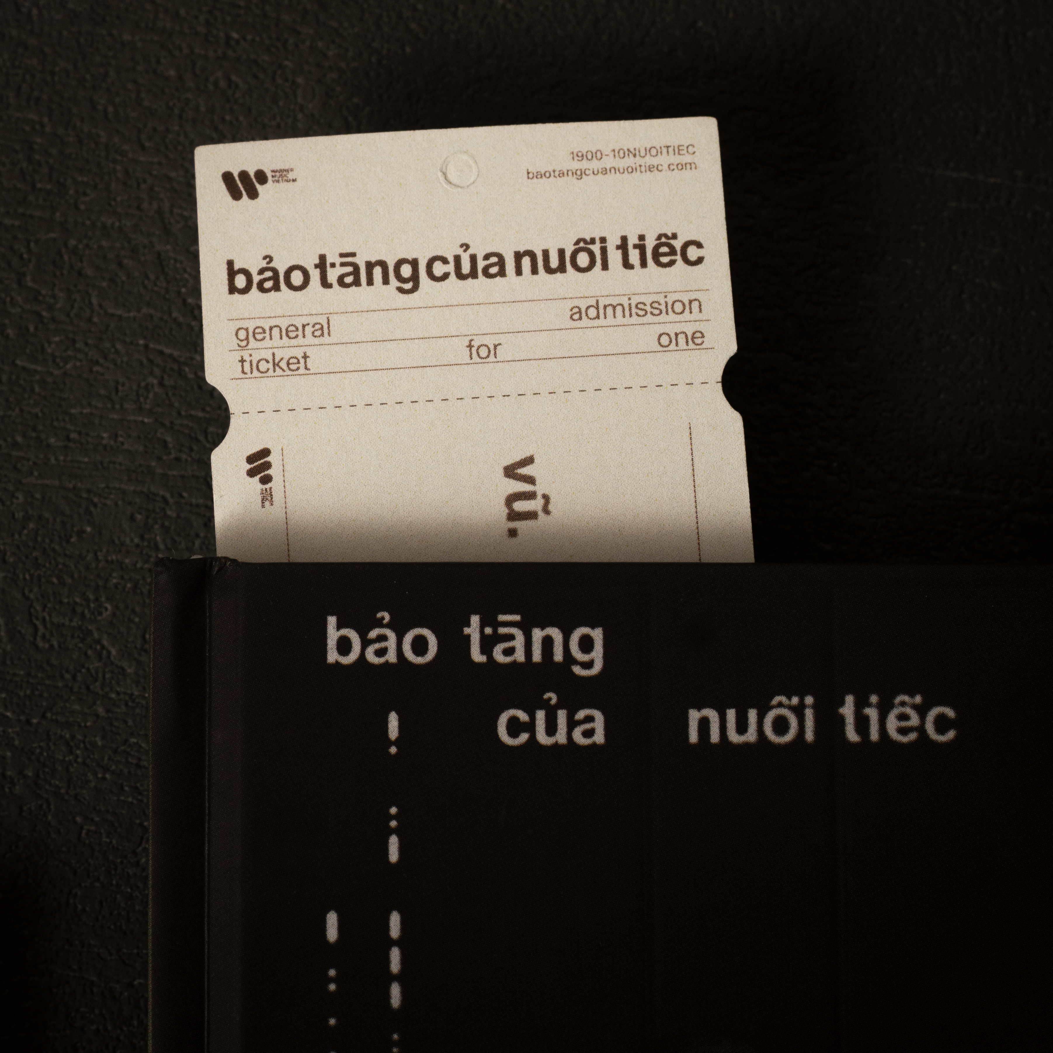
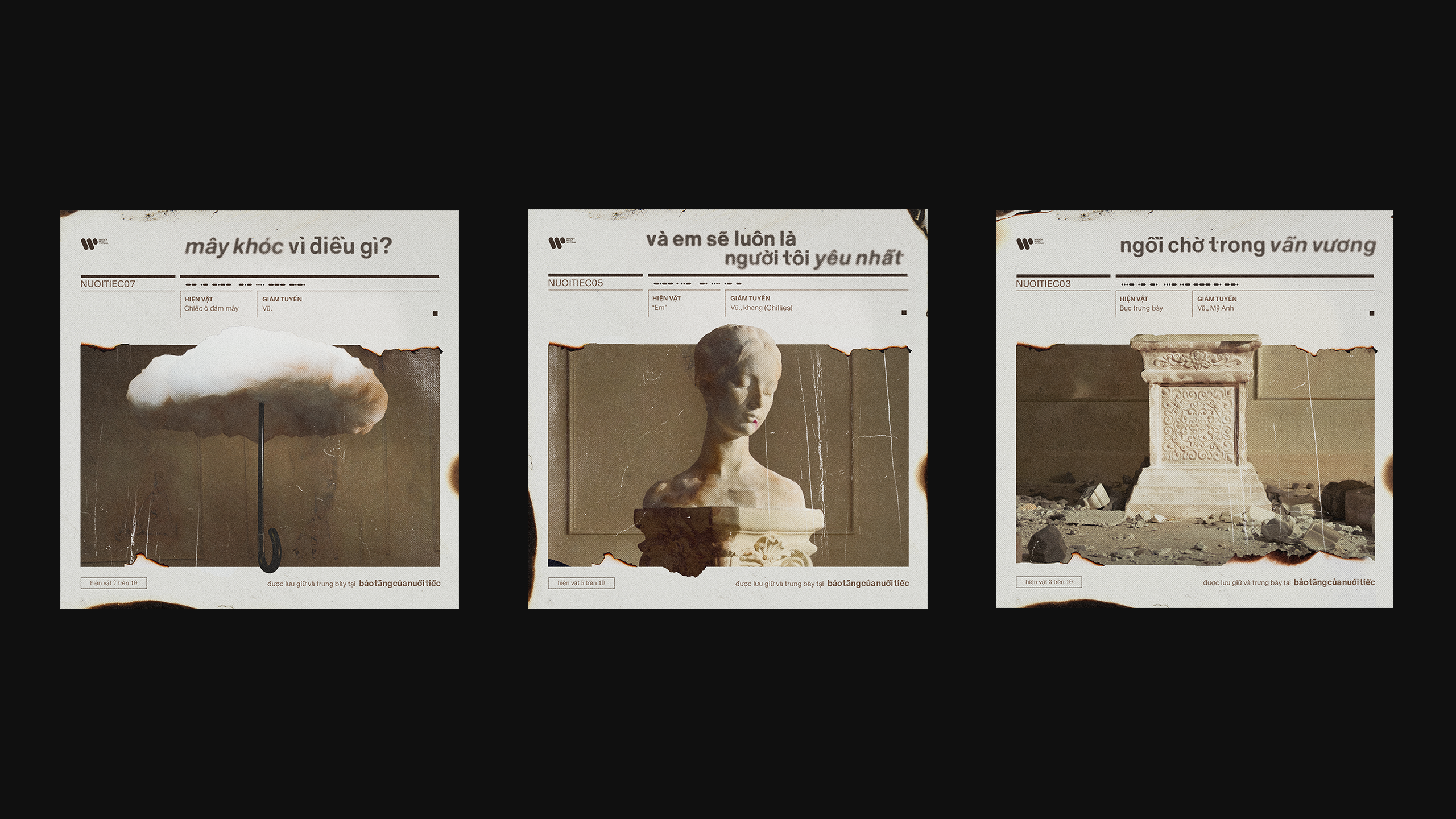
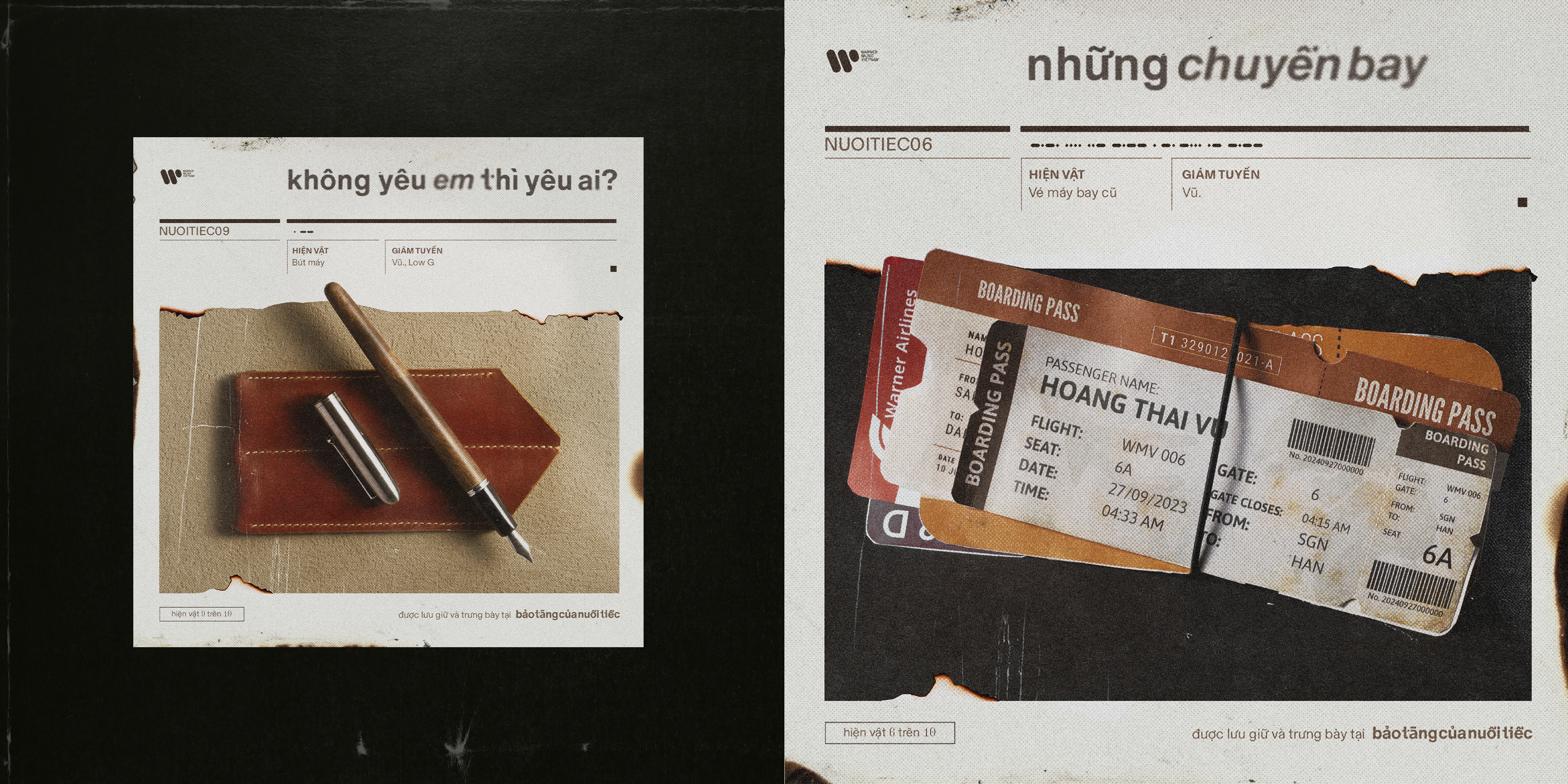
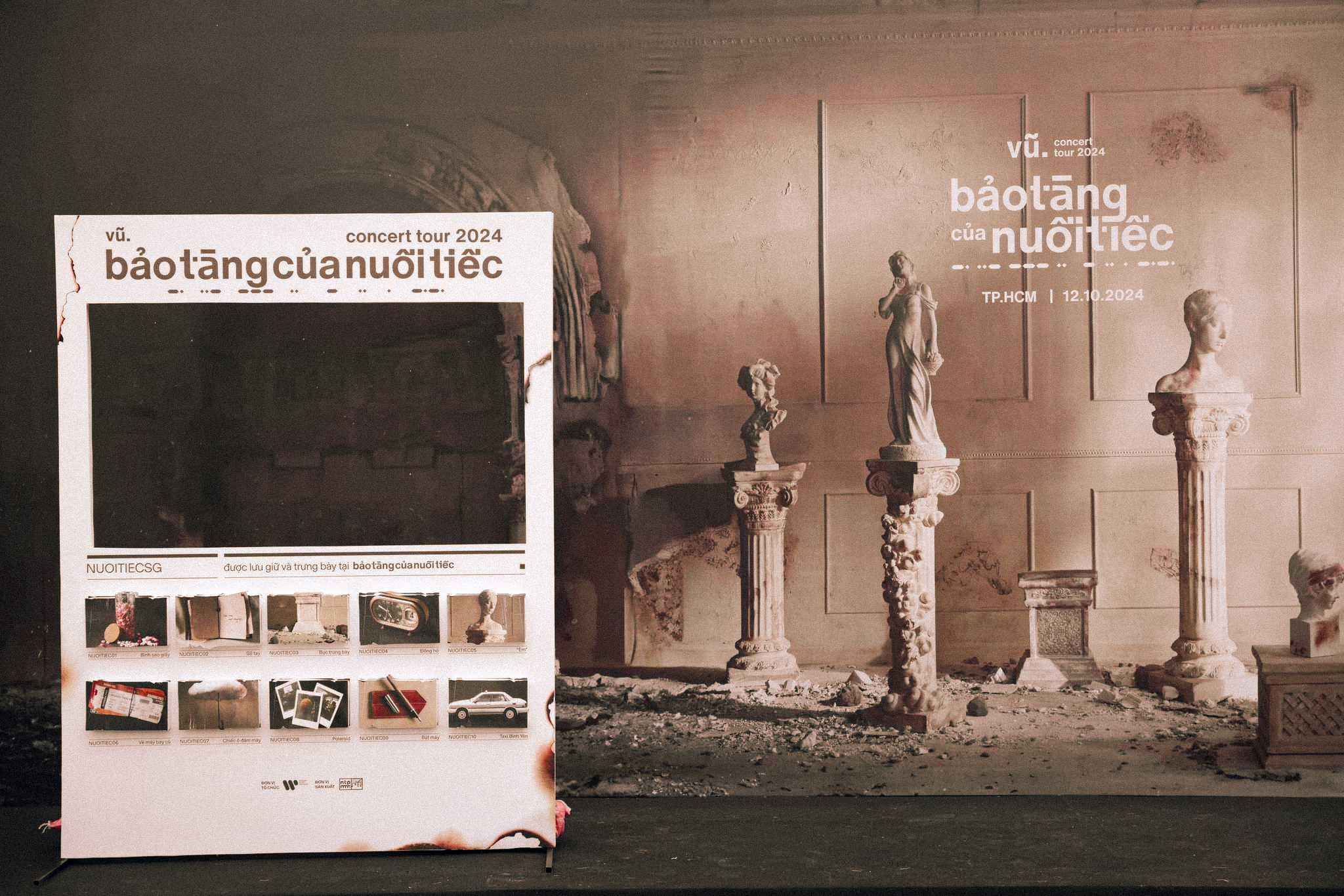
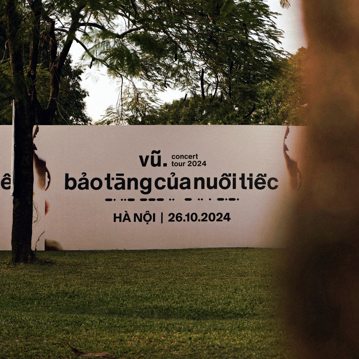
MoiBao Tang Cua Nuoi Tiec (Museum of Regrets) marks the third studio album from Vu., one of Vietnam’s most influential indie artists. Each of the album's ten tracks is imagined as an exhibit within a “museum of regrets,” symbolized through the system of design elements such as burnt paper textures, and sentimental keepsakes as artefacts. The album’s visual identity extends beyond album packaging design into concert installations and merchandise, creating a cohesive, immersive experience.
Year
2024
Scope of Work
Design Direction, Typography, Packaging Design, Product Photography
Artist
Vu.
Record Label
Warner Music Vietnam
Executive Producer
Dan Ton
A&R
Thu Hien, Tiayy
Marketing & Promotion
H. Luu, Eden Tran, Stella Dang, Quynh Loan, Dinh Kha, Tuyet Anh
Physical Album Production
Nhi Ton, madbabycatz
Design
Dung Ngo
“Bao Tang Cua Nuoi Tiec” concept photoshoot
Photographer
Cow10 @cow10_
Producer
Patrick@xxiiipl
Lightning
Fei Lung @fei.lung
Assistant
RMD @rmd_m
Art Director
Leo @__leeoh
Set designer
Ho Chun @chun_cl_
Props Man
Tung @twolayers2
Hair
Ziggie @ziggggie
Makeup
KK Tang @_k.tang _
Styling
Gel @gel.yiu
Special Thanks to LP CLUB.
Photographer
Cow10 @cow10_
Producer
Patrick@xxiiipl
Lightning
Fei Lung @fei.lung
Assistant
RMD @rmd_m
Art Director
Leo @__leeoh
Set designer
Ho Chun @chun_cl_
Props Man
Tung @twolayers2
Hair
Ziggie @ziggggie
Makeup
KK Tang @_k.tang _
Styling
Gel @gel.yiu
Special Thanks to LP CLUB.
Physical Album Photography
Photographer
Dung Ngo
Concept & Styling
Dung Ngo
Lighting
Bam Tran
Photographer
Dung Ngo
Concept & Styling
Dung Ngo
Lighting
Bam Tran
Concept
Sign of The Times
The visual identity draws inspiration from the structured, institutional nature of a museum, where memory, emotion, and artifact are preserved within a system of order. By fusing the bureaucratic, hierarchical language of archival systems with a sense of personal sentimentality, the identity reflects how regrets and memories are often catalogued, revisited, and reinterpreted over time.
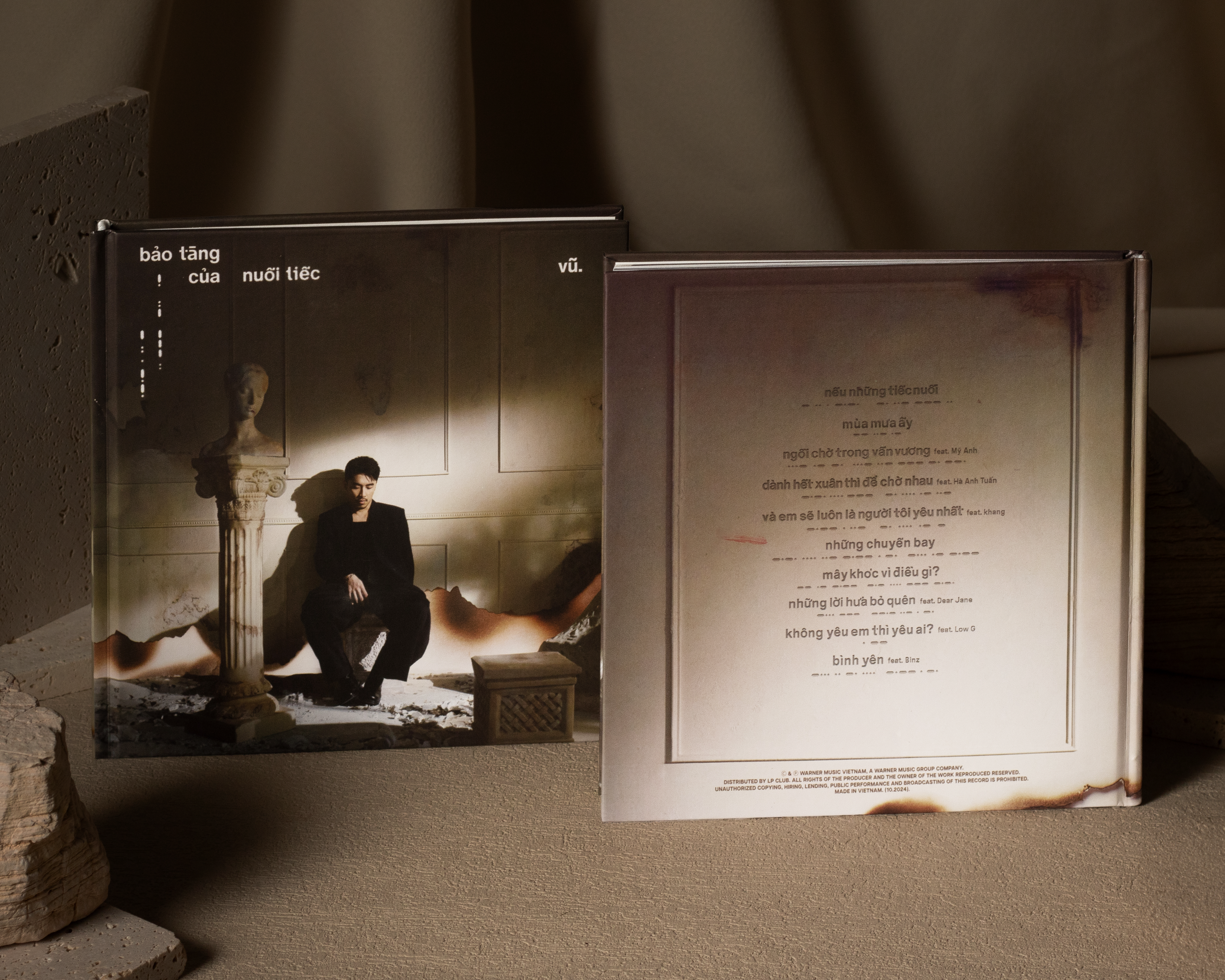

Packaging Design


Artefact Design
Each track in the album is represented by a symbolic artefact, carefully curated as a sentimental keepsake that directly relates to the song’s lyrics. These objects encapsulate the emotional core of each story, serving as visual metaphors drawn from moments of longing, regret, or personal reflection. Though varied in form, the artefacts are unified through a consistent lighting and material language, reinforcing the systemic, archival nature of a museum.


Merchandise
The project expands into a line of thematic merchandise designed as mementos from an emotional exhibition. Key items include enamel pins and leather tags. Each product carries forward the album’s symbolic language while offering fans tactile, personal extensions of the listening experience.
Concert & Booth Design
The visual identity extended seamlessly into the concert tour, encompassing booth design, stage graphics, LED screens, and environmental visuals. With over 22,000 attendees across the country, Bao Tang Cua Nuoi Tiec became the most attended concert tour by a Vietnamese solo artist in 2024.


Behind The Scenes
< style=![]() "width:300px; height: 300px; object-fit: cover">
"width:300px; height: 300px; object-fit: cover">
 "width:300px; height: 300px; object-fit: cover">
Year
2022
Supervisor
Giang Nguyen
Scope of Work
3D Concept, Typography, Editorial, Interactive
2022
Supervisor
Giang Nguyen
Scope of Work
3D Concept, Typography, Editorial, Interactive
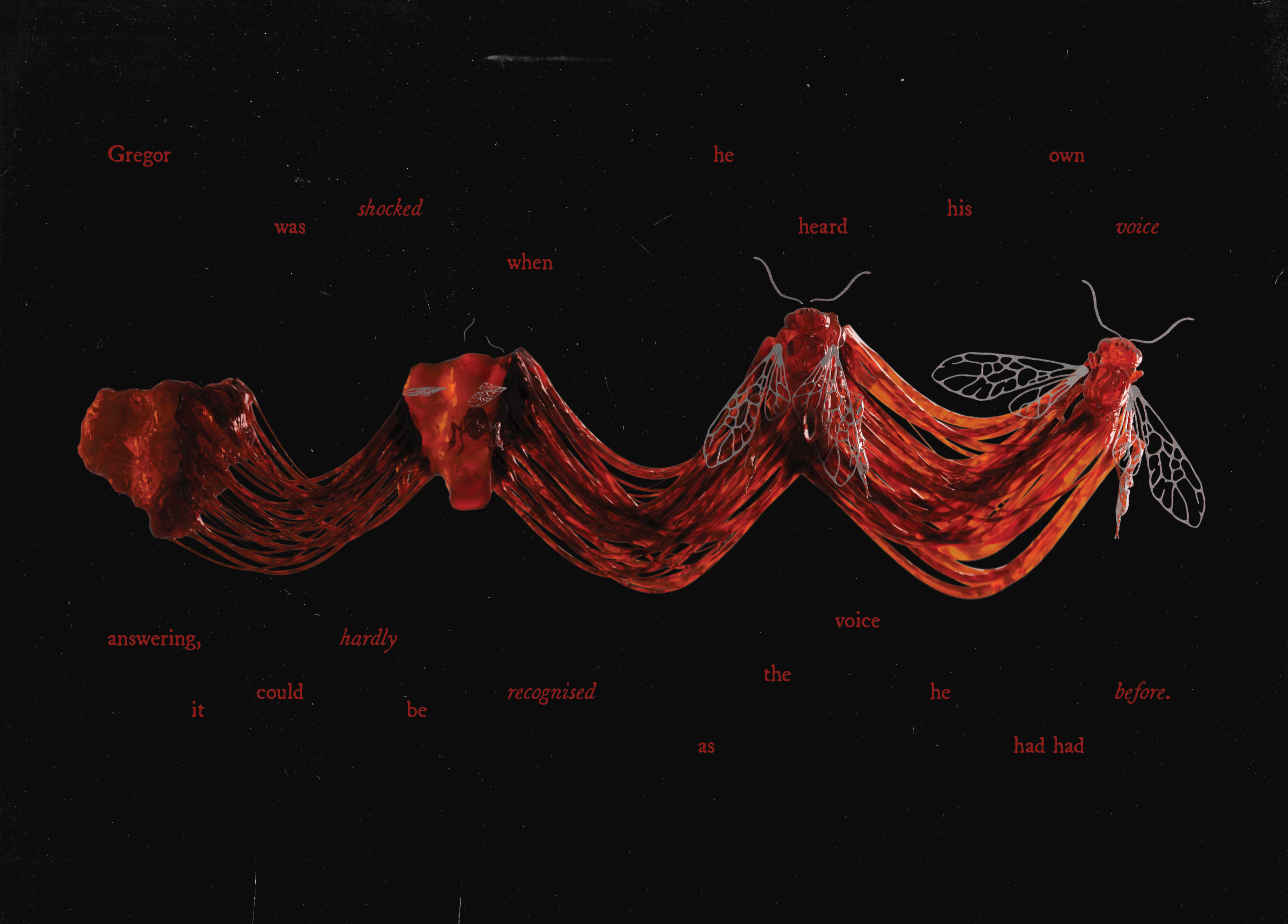
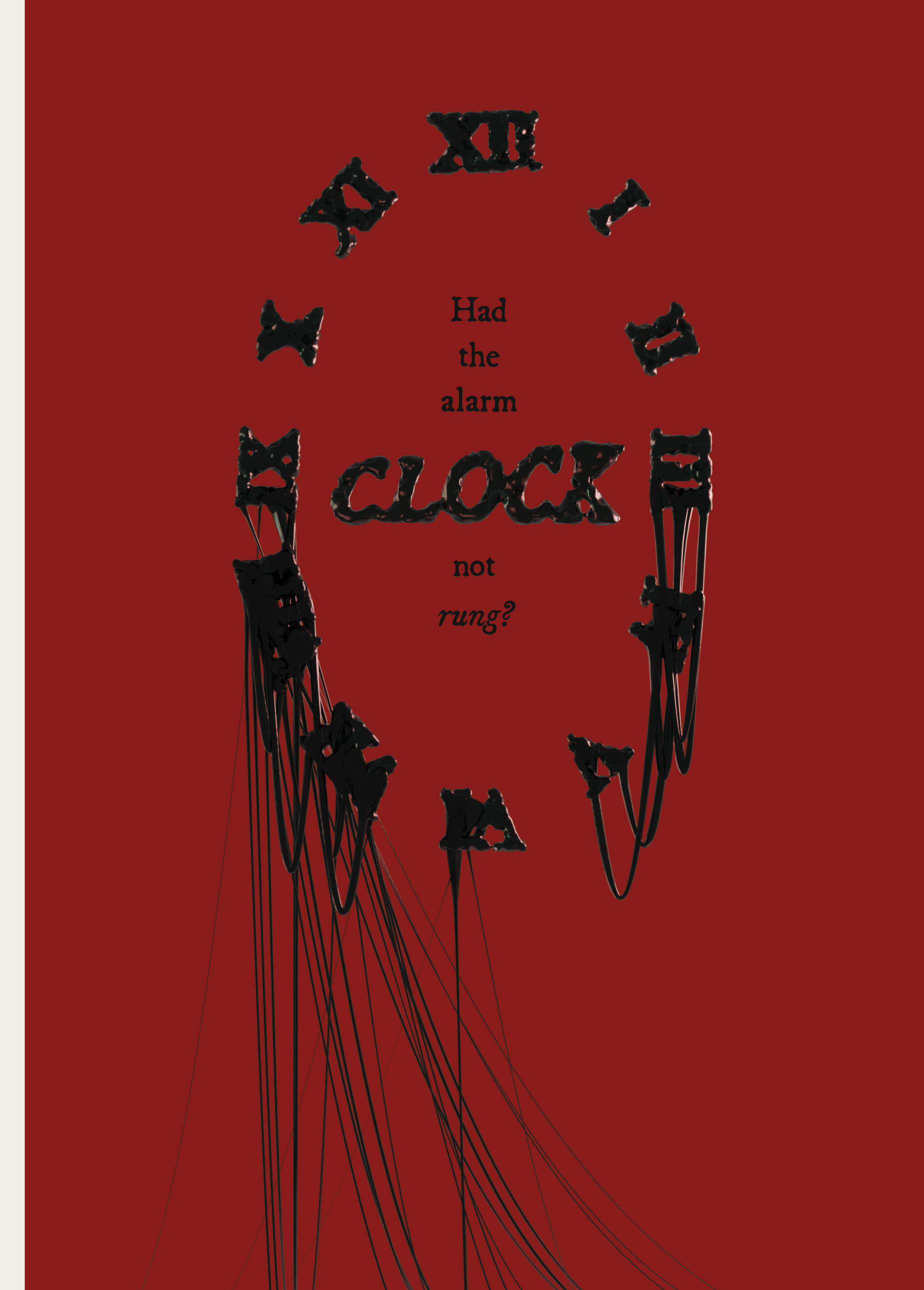
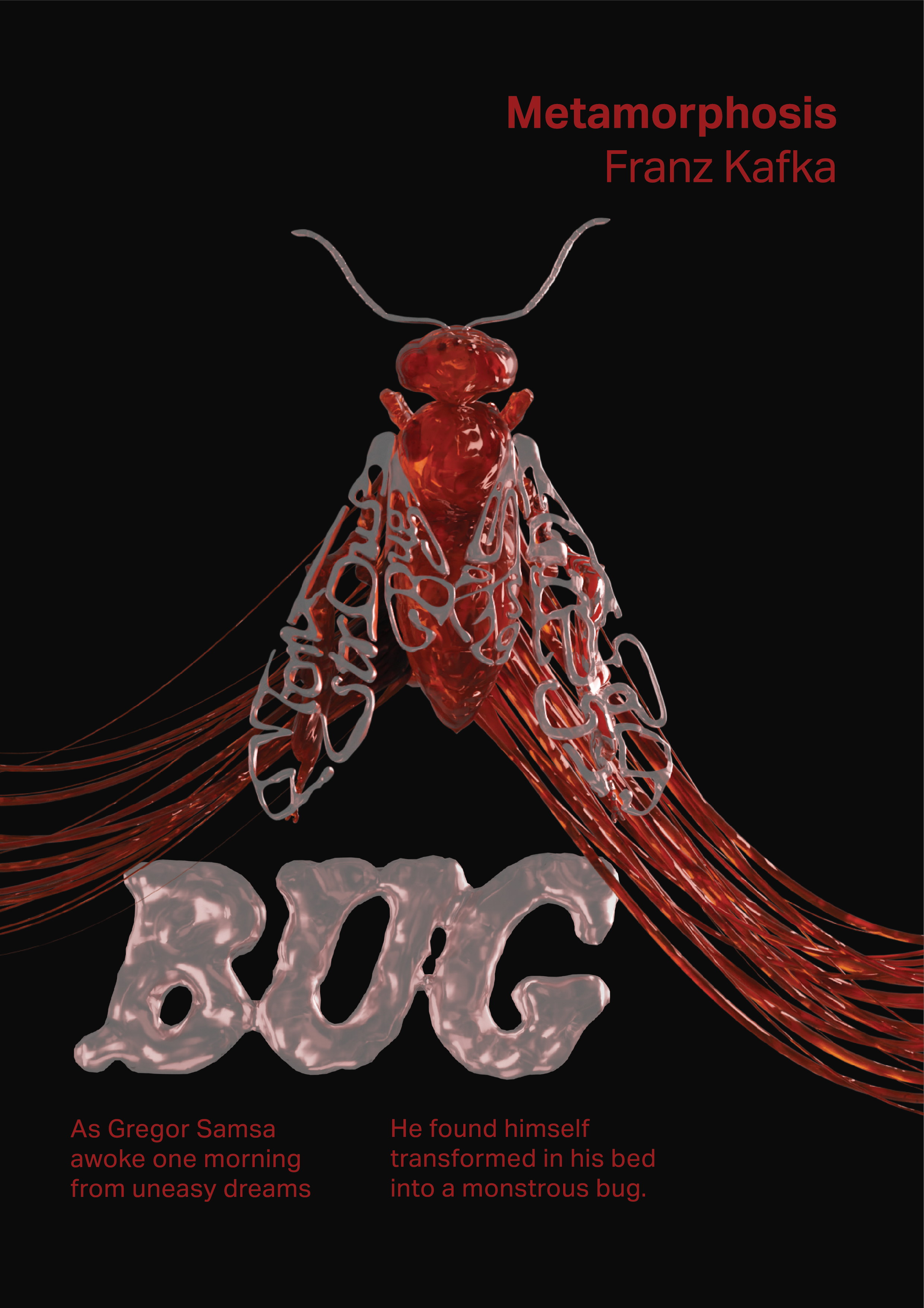
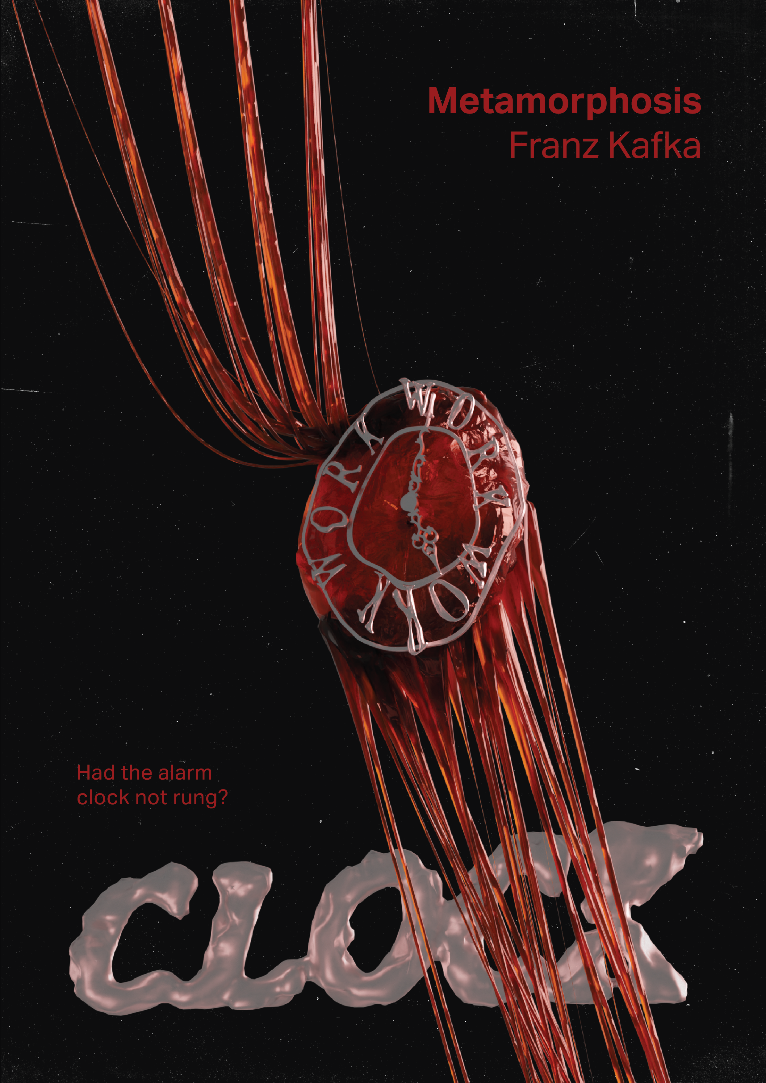
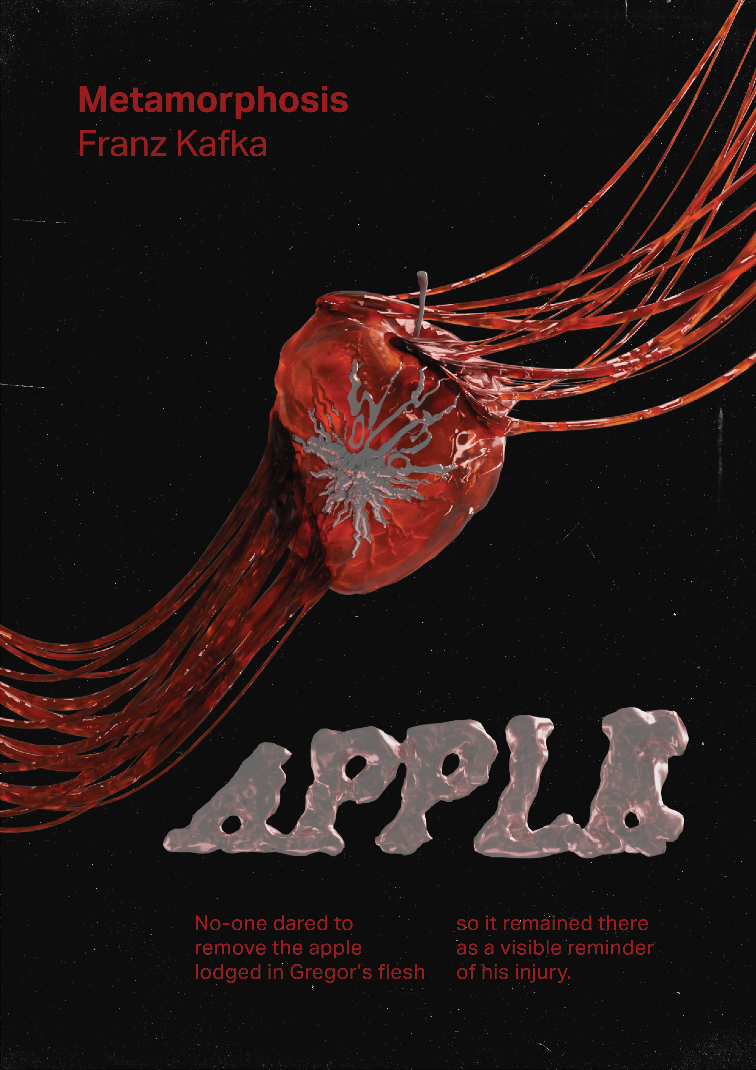
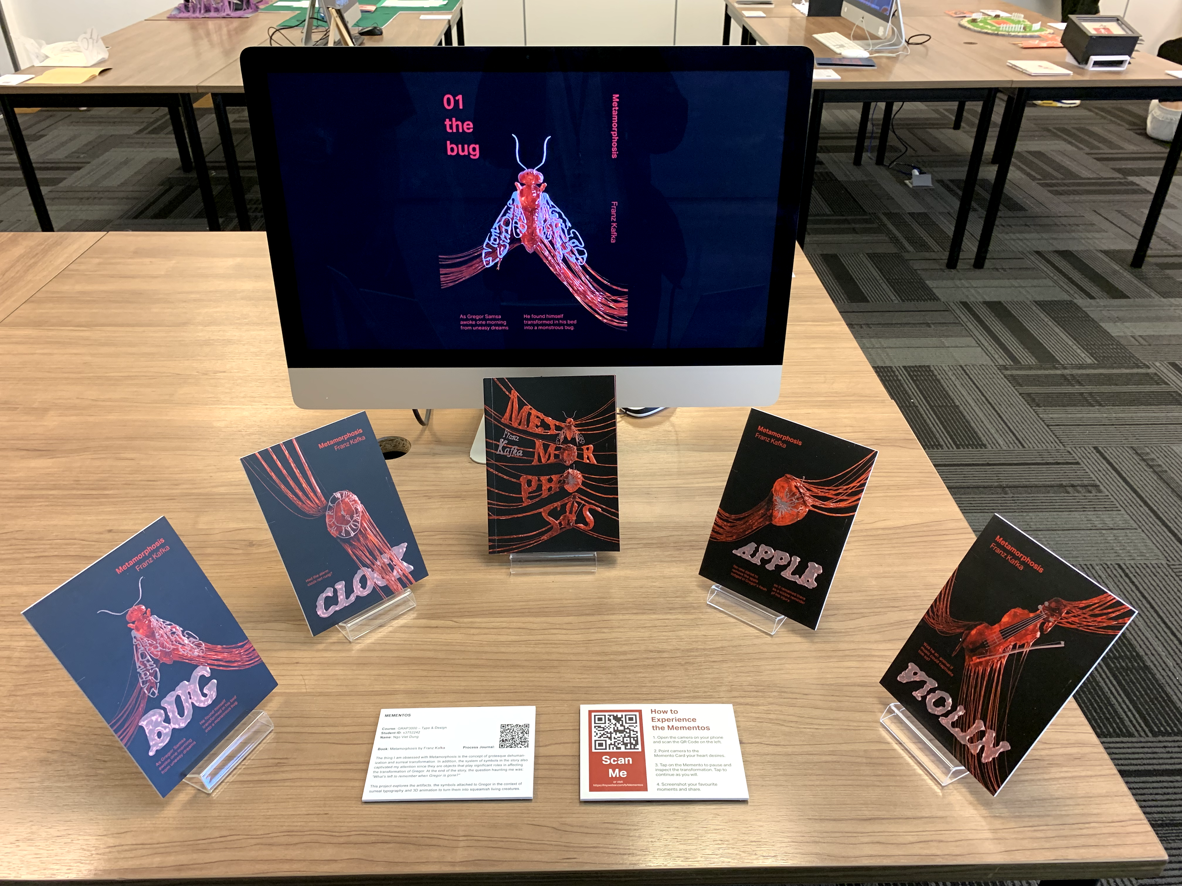
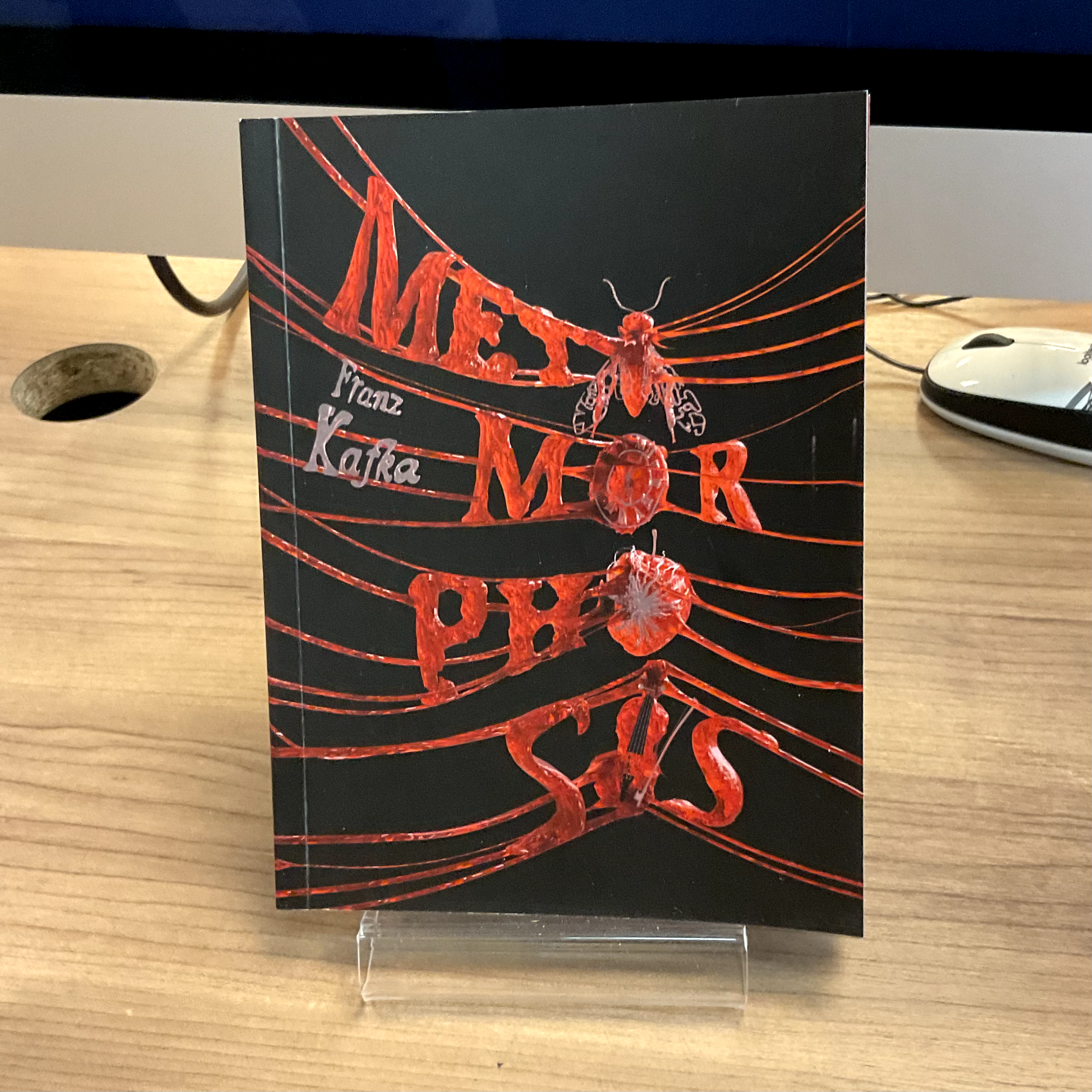
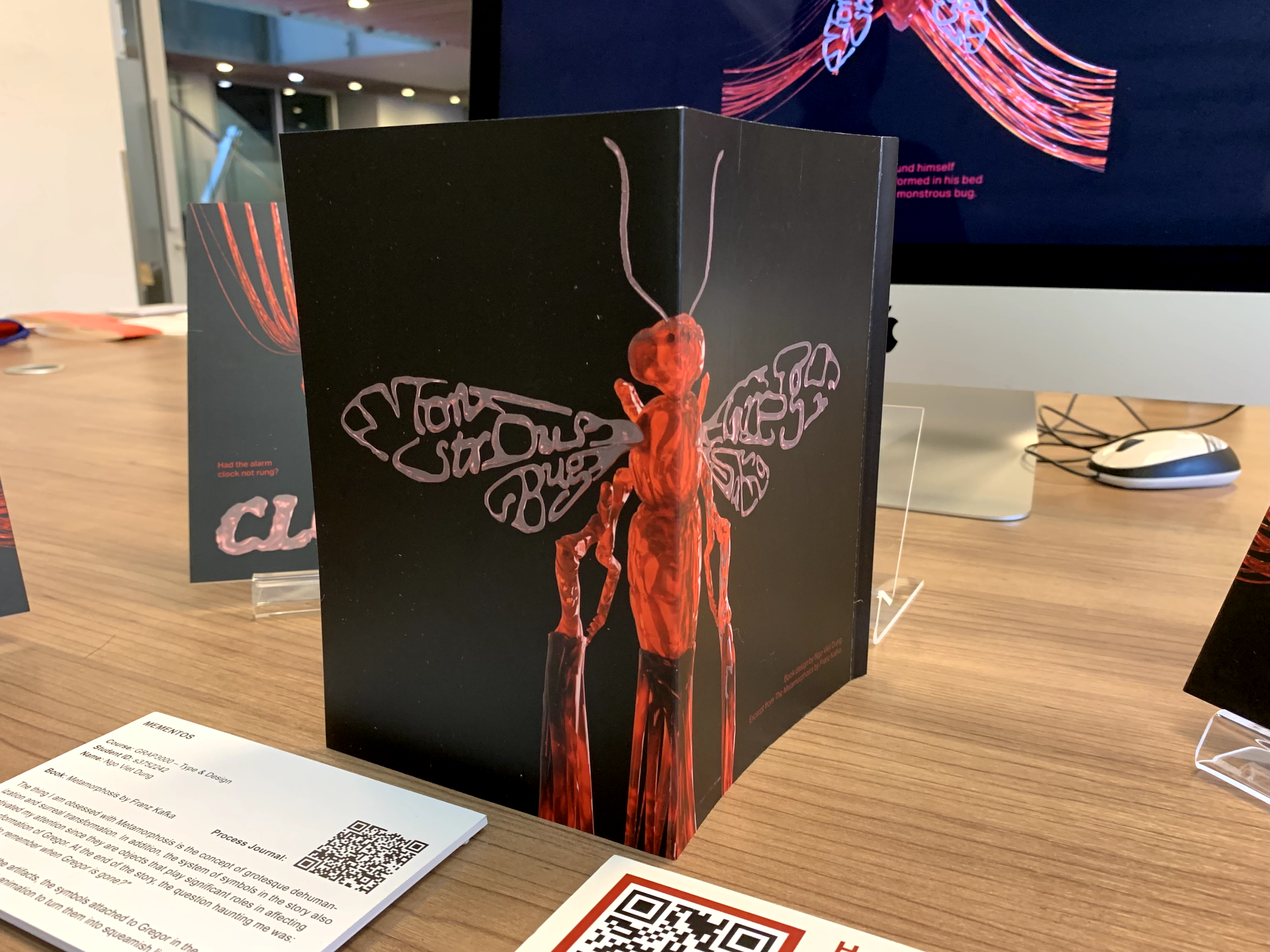
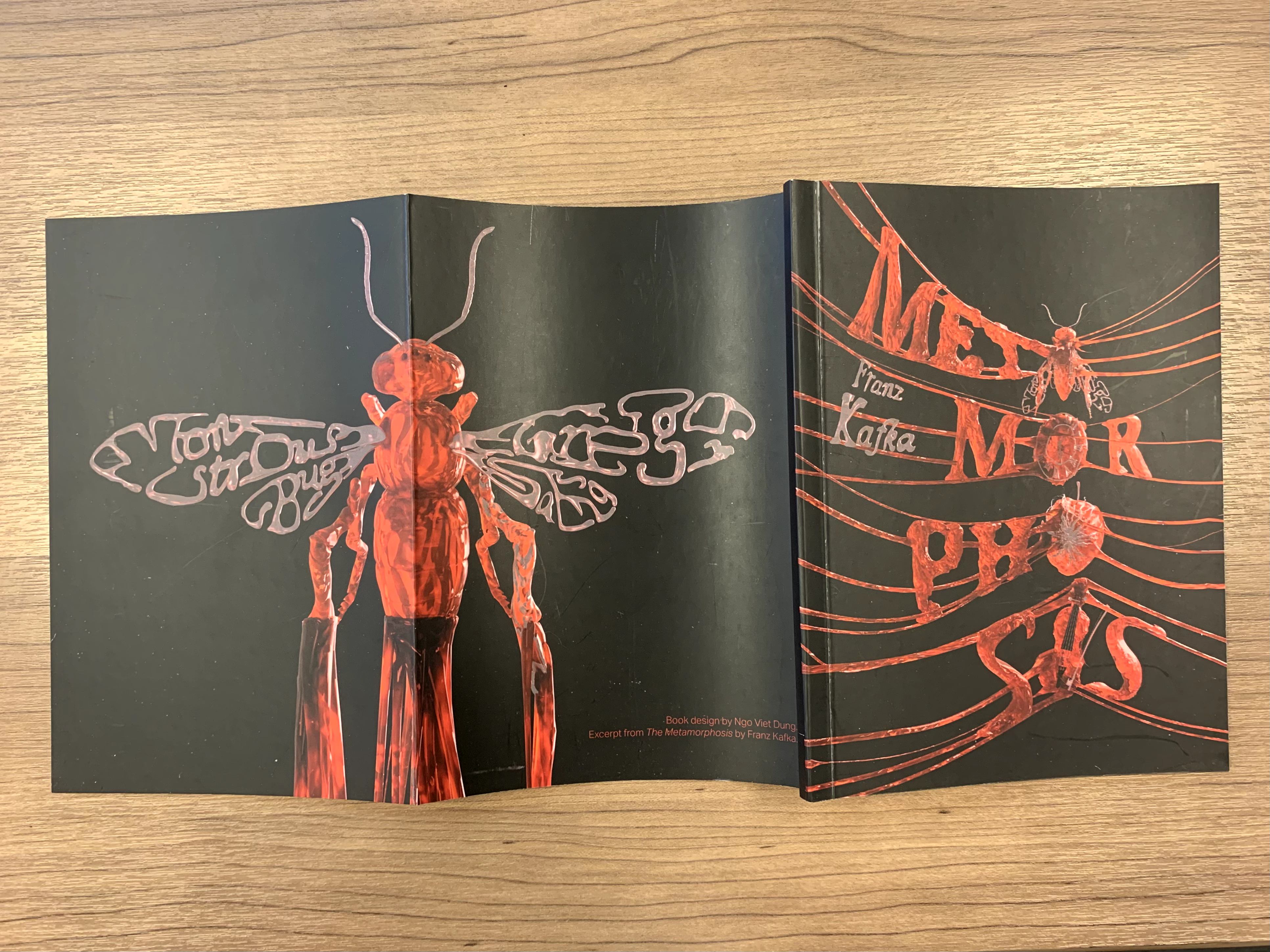
Mementos
Mementos is a project taking inspiration from Franz Kafka's magnum opus Metamorphosis. The goal of the project is to turn the novel's typographic material into a format to be experienced.
The thing I am obsessed with Metamorphosis is the concept of dehumanization and surreal transformation. In addition, the system of symbols in the story also captivated my attention since they are objects that significantly affect Gregor's transformation. At the end of the story, the question haunting me was:
"What's left to remember when Gregor is gone?"
"Will he be remembered at all?"
.


Big Idea
As the assignment requires the outcome to be related to typography, my big idea for the project focuses on the transformation of the letters into the symbol from Metamorphosis. This approach aims to align with the theme of the story, which is a surreal deformation into a monstrous, disturbing entity.
Art Direction
I decided to employ the medium of 3D since it could enhance the effect, turning the letters and symbol into organic, breathing, moving, living creatures.

Sketches
After deciding to focus on the metaphorical aspect of the novel, I move on to analyse symbols from the novel to pick out the most significant ones.
Although Metamorphosis is packed with metaphorical imageries, I shortlisted them down to 4 symbols: the bug, the clock, the apple, and the violin since they are most prominant imageries that mark the main phases of the story.
Although Metamorphosis is packed with metaphorical imageries, I shortlisted them down to 4 symbols: the bug, the clock, the apple, and the violin since they are most prominant imageries that mark the main phases of the story.


Book Layout Design
Final AR Card Design

3D Morphing Animation
The treatment for the 3D material and the animation aimed to embody the notion of transition, transformation, or to be exact, deformation. As the symbols and letters morph, they emphasize the deformation process of the story.
AR Experience Demonstration
As the viewers scan the memento card, they will experience the morphing of the words into symbols. To make it even more interactive, the viewers could freeze and continue the morphing transformation at any moment by tapping on the screen. This allows them to inspect the morphing more thoroughly and thus, engage with the project better.
The AR Experience is demonstrated in the video below.
The AR Experience is demonstrated in the video below.
Exhibition Booth
Design Document

aa
Year
2020
Supervisor
Hellmut Monz, Patrice
Scope of Work
3D Concept, Animation, Mixed Reality
Year
2020
Supervisor
Hellmut Monz, Patrice
Scope of Work
3D Concept, Animation, Mixed Reality
Heavenhood
Heavenhood is a VR walking simulator that explores the theme of dystopia underneath the utopia camouflage. As the player progresses through the game, they interact with the surroundings and discover the underlying disturbing truth. Under the control of excessive surveillance, human lose their privacy, and eventually, their identity. Heavenhood aims to challenge the ideal standards of society and highlight the invasion of technology in our lives. At the end of the day, whether Heavenhood is a utopia or dystopia, it depends on the perception of the player.
Project Trailer
Concept
Tackling the genre of technological dystopia, the game aims to build a twist that tricks and flips the perception of the players. In order to do so, utopian and dystopian elements are respectively introduced in the experience. After being exposed to a utopia in the appearance of a dream suburban neighbourhood, the players will realise that humans are cloned and replaced by robots.


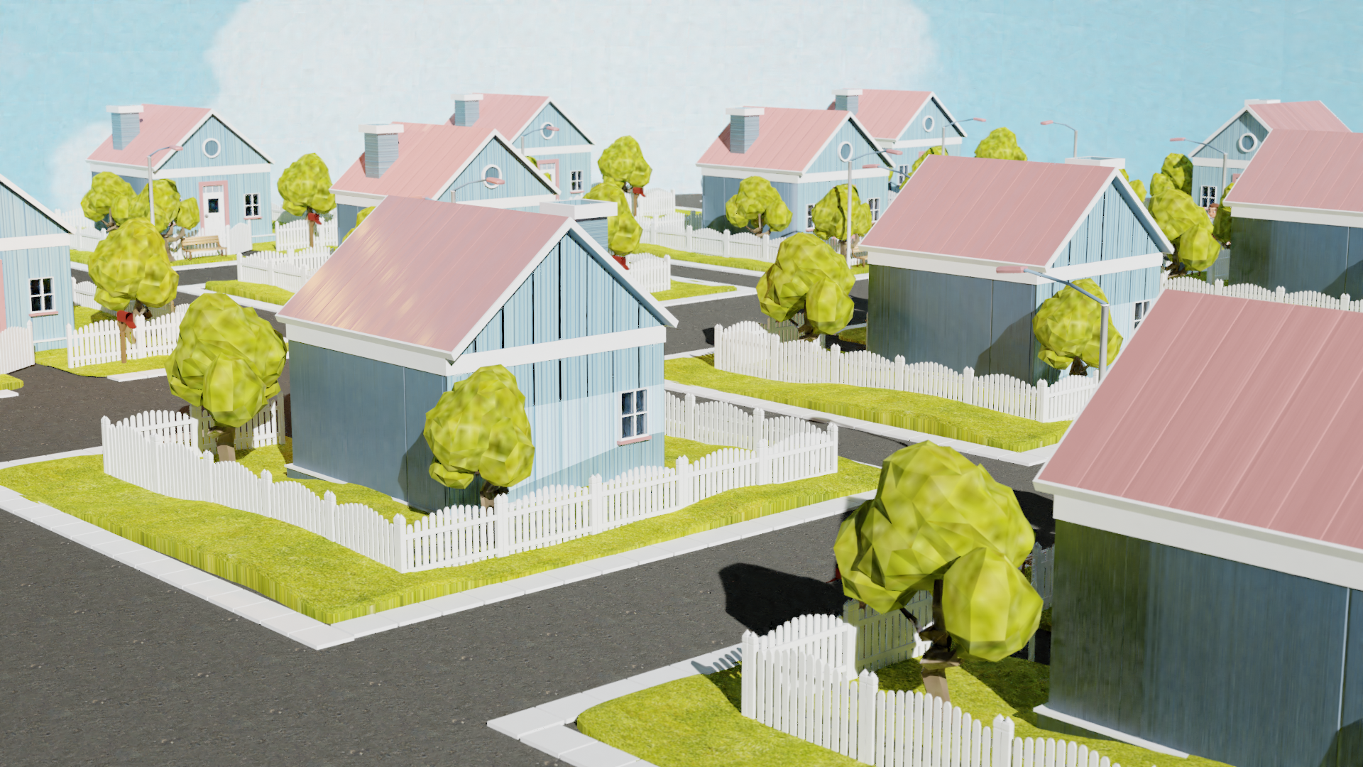
Visual Style
To trick the players into believing that they are present in a perfect heaven-like neighbourhood, pastel colours are implemented for a sweet and soft mood. In addition, the 3D graphics are designed to be blocky and rounded to enhance friendly, innocent values. This is to create a vivid contrast between the utopian camouflage and the mechanical details of the dystopian side. As a result, it becomes more disturbing and uneasy on the players when they discover the underlying truth.
Character Design
The characters are dressed in 1950s clothes, an optimistic era of America. This aims to mock the utopian standards by modeling the characters after the cliché American stereotypes of respectable white collar working men and the ideal housewives.
They are always happy with a constant smile on their faces. This depicts a dream-like life as if they are characters from a doll house.


Environment Design - Utopian Elements
The neighbourhood
Inspired by the idyllic housing of America in 1950s, Heavenhood introduces houses that are systematically built to be identical. Also, the iconic white picket fence and the perfect green lawn also pay tribute to the American 1950 utopian vision.


The Ferris Wheel
The Ferris Wheel acts as a metaphor for the distraction of the society, which represents the entertainment, leisure and hedonistic way of living. This is inspired by the theme park Pleasure Island from the iconic movie Pinocchio (1940).
Being placed at the heart of the neighbourhood, the Ferris wheel becomes the main attraction of entertainment. The excitement of the residents is demonstrated in the long queue waiting to take a ride.
Being placed at the heart of the neighbourhood, the Ferris wheel becomes the main attraction of entertainment. The excitement of the residents is demonstrated in the long queue waiting to take a ride.

Dystopian Elements
The Robotic Details
The robotic details underneath are the big reveal, also the climax of the VR game. The players are able to reveal the truth by grabbing the masks of the residents. This point warps the perception of the players and makes them realise that there is actual trouble in paradise.

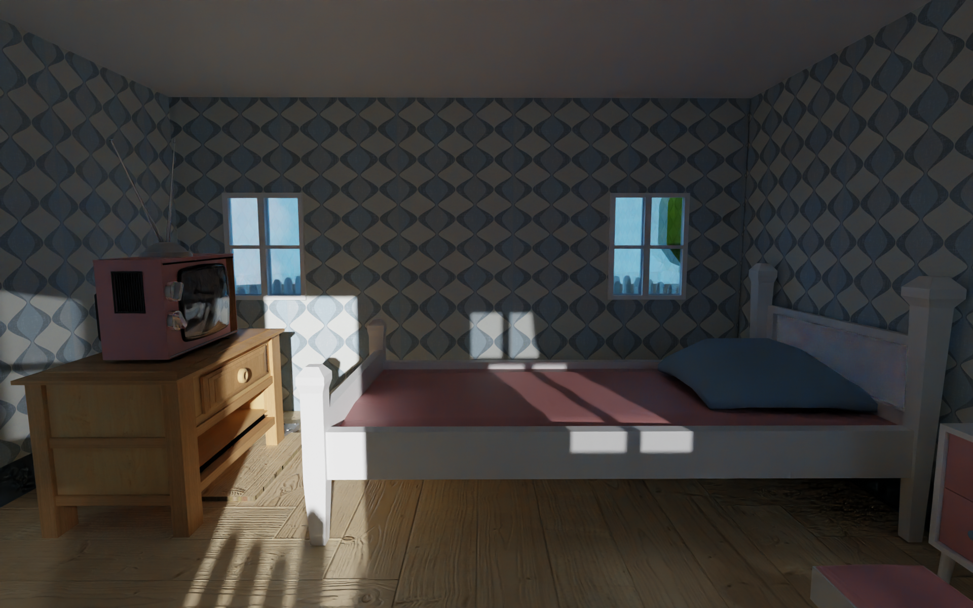


The Bedroom
The houses are an essential part of Heavenhood. There are hints and secrets inside awaiting the players to explore. Inside the houses are the bedrooms. Once entering one certain bedroom, the players are one step closer to reach the secret trap door that opens the path leading to the dystopia.


The Corridor
As the transit station between the utopian camouflage and the technological dystopia, the corridor introduces a change of mood. The most noticeable change is the colours. From pastel bright hues, the corridor flips to a to darker, dimmer scene. The monochromatic bluish colour scheme also reveals the dominance of technology. As a result, this creates the contrast between two realms.


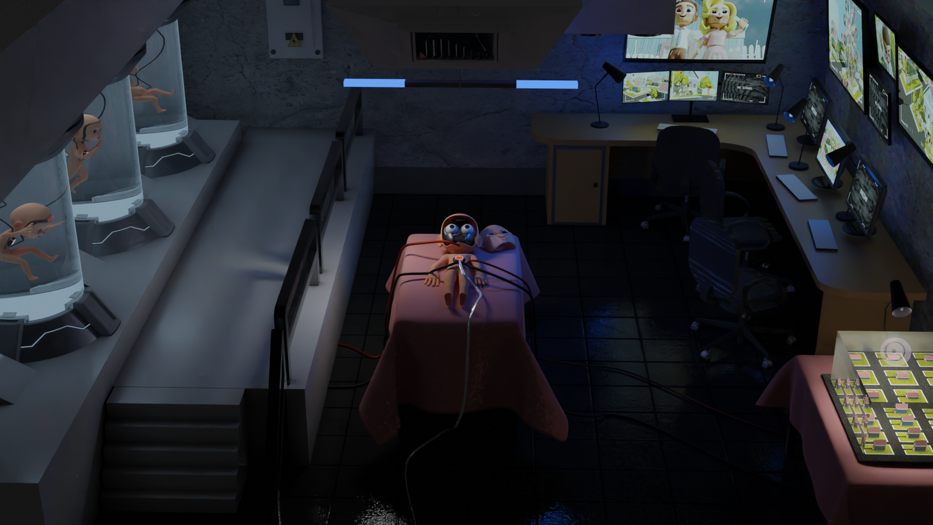
The Lab
The lab is by far the darkest and most disturbing area of Heavenhood where the dystopian nightmare is revealed in all its glory. Packed with dystopian elements, this area uncovers the origins of Heavenhood and make the players ponder upon the consequences of the technological dominance.

All the questions are left open for the players to interpret using the graphical input they have just experienced. They are encouraged to explore all of their conspiracy theories about Heavenhood. At the end of the day, whether Heavenhood is a utopia or a dystopia, the answers are up to the players.
dungvngo.design@gmail.com
(+84) 0936783143
Ho Chi Minh City, Vietnam